Some Experiments

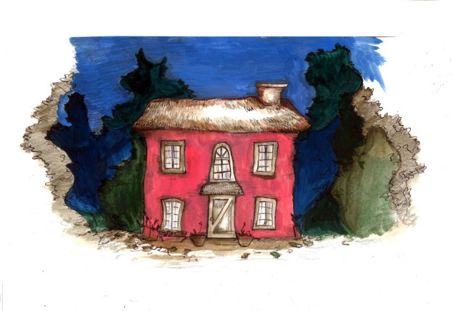
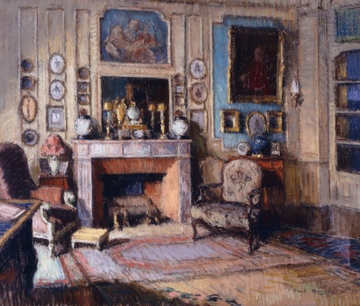
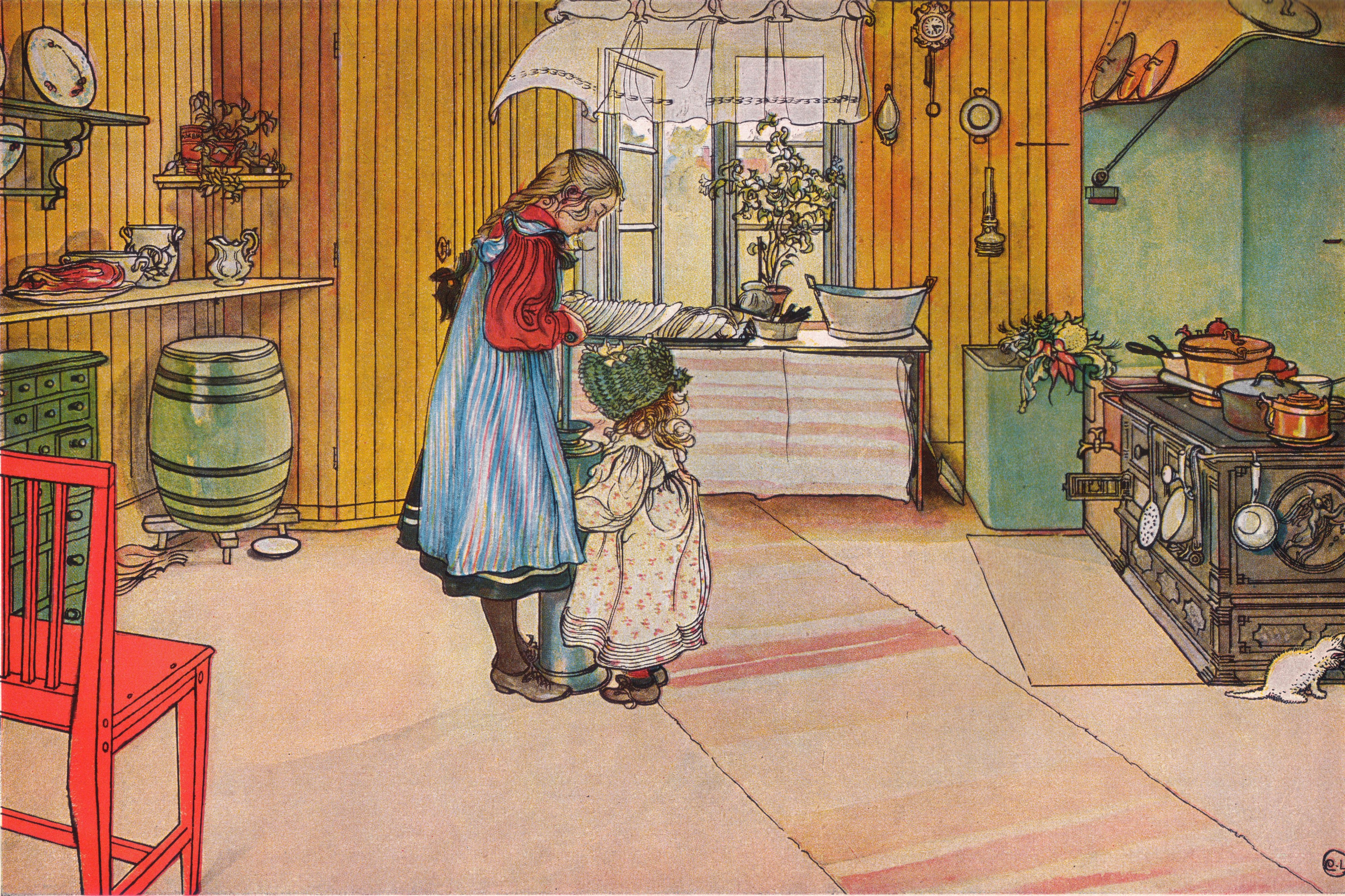
These experiments were fuelled from the practice of the artworks produced by Carl Larsson and Jean Paul Hugues collection of 18th century vintage home interior studies.

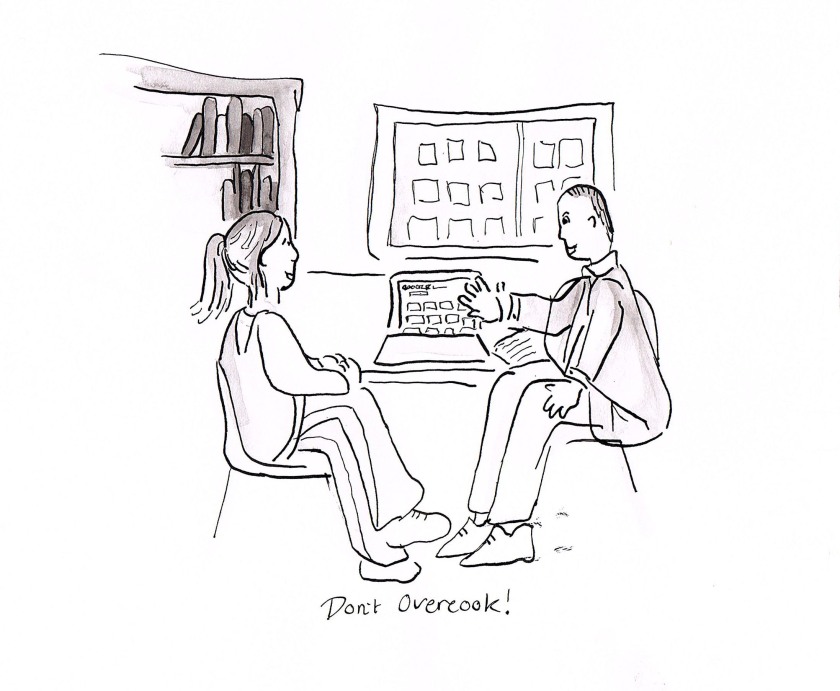
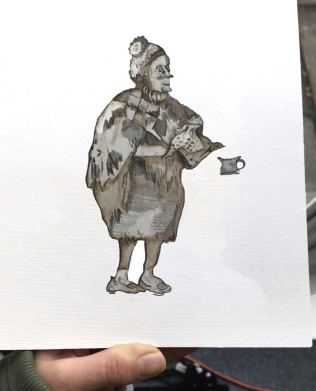
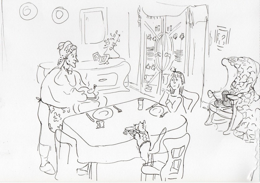
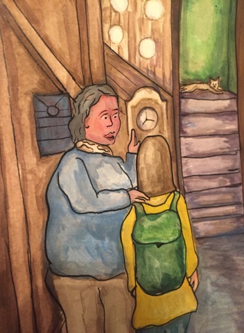
In these experiments of my Grandma Character (shown below) I explored the Photoshop technique with images that contained more information that had more elements of drawn textures and shading. These results will be thought of and carried into the future approach to my visual image making. I have contemplated the muting of the ‘filling in’ colour aspect and making the line work the strongest telling feature of the work using layers in Photoshop to explore this. Remebering my tutors words of advice to not overcook the my craft.

Studies of Grandma Character Development

grannn
granny

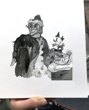
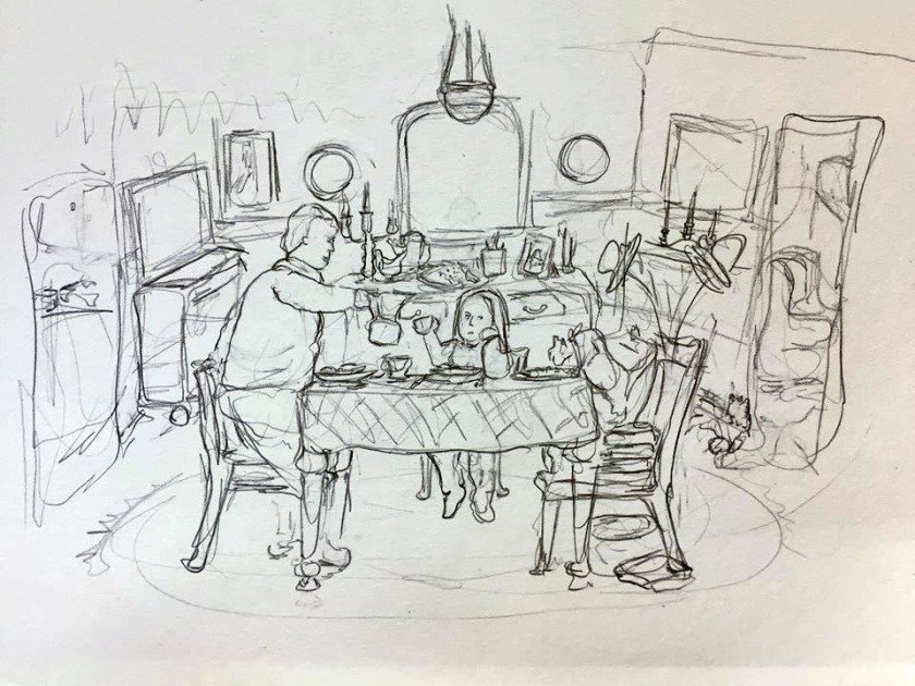
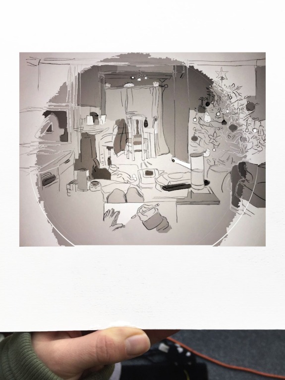
Observational Study of Living Room 

I really like how the process of using the magic wand tool on Photoshop creates surprises and accidents to play with. The circular scope of shading that is shown below in my observational study of my family living room was interestingly the result of the flash photography of the original artwork that would have not been present if the original artwork had been scanned. I also feel the attraction to this process of transferring my original artworks is due the fact that the professional rules are typically adviced to the correct process of scanning artwork to capture the better result. However being creative I like to find alternative routes and enjoy the feeling of challenging rules and inviting new perspectives established in the thoughts of my visual image production.

home print

Inspired Visual Languages

Using the inspiration of the paintings depicting 18th century vintage home interiors created by artists Jean Paul Hugues and Carl Larsson. The practice of the visual languages is explored in my drawing interpretations of their beautiful scenes of the richly decorated homes shown in the images below. I have taken on board my personal tutors advice by attempting to recreate the work from the masters and building a closer relationship with the inspirations I feel from the artwork of others as a tool to warm up and be of more use as a valuable teacher to feed into my practice. The process I most favour and use from these particular inspirations is drawing. I concentrate on my sources of wisdom and inspiration through the breaking down of the image process and follow the ideas of the original makers through the intimate network of the production of line on paper.  I enjoy this practice very much and see the value in this practice as providing me with skills such compositional awareness and can see how it excites ideas and inspires change to provoke the next work I make using my own ideas and wishes of fulfillment.

The results below show how they have integrated into a digital manipulation using professional software of Photoshop. The interesting effects of shading is a method that I unintentionally stumbled across when learning how to brighten photographed images of my drawings to see this in comparison to scanned results. The magic wand tool allowed me to flexibly adjust the selections of completed shapes and adjust their colouring in comparison to the rest of the scene. This was a process that was fast, flexible and enjoyable. I like the results very much and they have allowed me to create a sense of depth and control of the image beyond what I thought I was capable of. This new approach of Photoshop manipulation may hold exciting possibilities for the future work that is to come. I also see a favour for the simplicity of the image creation focusing the efforts on the language of line feeding the story particularly with the first image below rather than the charge of the colour in the last image.

Illustrating the Masters Artworks

See my personal creations here and here that developed from this practice of artists works.


Jean Paul Hugues

During my Dissertation image database research using Bridgeman. I unintentionally came across the work of artist Jean Paul Hugues and his beautiful pastel study named ‘An interior of a Drawing Room’ dated between 1891 to 1950 (shown below).

824055

This image really engrossed my interest. I love the depth and the vintage aesthetic that connects so well to my envisioned story setting of Grandma’s Home that I am developing for my narrative. Hugues choice of pastel is quite unusual and I feel it gives it a texture that is really tantalizing with the visibility of the line gestures at our grasp. The colours of the image is a palette that suggest a friendliness and a refreshing feel of a happiness with those light and airy pastel tones in contrast to the grounding dark and naturalistic colours of earthy tones that I wish to mimic in my own experiments at some stage.

I carried out further research into the artworks of Hugues, where I found more similar depictions of olden yet fashionable home interiors that reflect quite a wealthy and comfortable living.  I have an interest in the way the furniture sits with other furniture in the spaces of the room. I particularly love the different assortment of chairs and picture frames that gives such fun with variation and a charm to the rooms.

Related image Image result for jean paul hugues

Carl Larsson

Following my Latest Feedback Tutorial I am using the advice from my personal Tutor Chris Glynn and looking up the suggested artists that were recommended to me.

On the list there is the Swedish painter Carl Larsson (1853-1919). According to my research Larsson’s many paintings include oils, watercolours and frescoes.

Image result for carl larsson
‘Flowers on the Windowsill’ – Watercolour
Image result for carl larsson
‘The Kitchen’ – Watercolour


Image result for carl larsson
‘Workshop’ – Watercolour

From my reading on this 18th century painter. I have learnt that Larsson enjoyed painting the domestic home and his family were his favourite models carrying out their casual activities in a lot of his works. Larsson’s, wife Karin Larsson was an interior designer so the interior of the family house is decorative and thoughtfully presented to their personal needs and imagination.

I love the vintage feel of the paintings and their soft and delicate tone of colours that is presented through a frequent use of watercolours. The above images show a selection of Larsson’s work that caught my eye. The people depicted in the scenes of the work carry on with their activities unnoticing the observant eye of Larsson desiring to capture their moment forever in these paintings. They are warm and clearly made with a love for his home and family. The personal observations that show an undisturbed look into the life of Larsson’s home life makes them almost dream like and also a conscious reflection of thinking that I can gaze upon today and agree with Larsson on the power of the intimate focus that evokes a beauty through an appreciative simplicity on this subject of a private life.

Need that artist practice.

25395552_10210266998418530_1482224328_n 
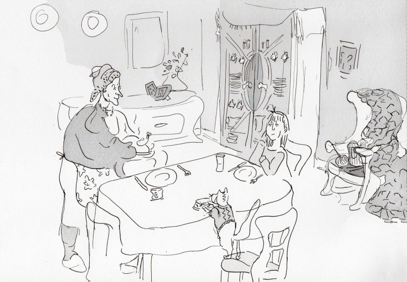
I can see from this image that my line work with ink and pen and on challenging surface such as acrylic paint needs work. As the textures of the acrylic paint is not all as smooth as a plain sheet of paper. The paint creates bumps and this widens the fountain of my pen and creates thicker lines when I didn’t necessary want them. Practice with illustrating other professionals use of materials such as acrylic and ink will hopefully teach me their movements and thinking that should teach me of experienced level of compositions and by breaking down the process I can exercise my skill and technicalities to translate into my own practice. I really do hope to change the opinion that my work is not commissionable/commercial quality yet. It is my ultimate goal to produce highly purchasable outcomes.


Latest Developments

Below shows my latest working image making for my self-written Book Project. Adopting the techniques of Chris Glynn my personal tutor into the sketch processing of conceptualizing moments from my story using the professional sketching equipment and approach advised. I have approached this image with a love for drawing and lively, expressive image making. I have used components of physical objects that I recall seeing from my research visit to St Fagons and Jacob’s Antique Centre in Cardiff which reflects the imagined vintage and homely feel of grandmas character.

supper with gran kitchen

Using this sketch style I tested a technique adopting my closely analysed observations of illustrator Jo Davies’s process. I used a drawing I had created of the below ‘welcoming scene’ as a reference for the free-painting of the shapes that formed the desired scene below. As the final stage of the drawing I intend to illustrate on the surface of the painting with detail using line drawing created with a drawing pen and ink to cast out my expressive control of the image and passion for line that is used to highlight the expressions and activities within the illustration.

Chris Glynn my personal tutor offered his suggestion on this current work and stated that I don’t need to include so much colours going on in the work but a more coordinated selection. According to Glynn, colour work can be improved if I practice with real life references and practice with mimicking other artists work to explore and educate their working ideas and processes to influence my own practice.

Formative Feedback

advice
Just draw the moment, be loose be quick. 

On December 15th I had my Level 6 Term 1 Pass/Fail assessment Feedback delivered by my personal tutor Chris Glynn. I really value Chris’s advice and I couldn’t have been given a better tutor who seems to really engage with my ideas who supports and advises them whilst offering so many useful tips and direction with enthusiasm. In this tutorial we discussed that to improve my practice I need to develop and state more asserted interests and discover and adopt techniques following the research of artists and a greater understanding of the illustration profession. Along the way of this intimate research practice, Chris suggested that I make a regular connection with live drawing that can be adopted to these blog posts using memory or observational recordings of the present moment. Producing day-to-day drawings based on daily life and my contemplations is something that interests me and I can see how this will build a bigger portfolio of imagery and example my ability to produce fast turnover images essential for editorial applications. What I have grasped is that this research based engagement will get me into a better productive and skill exercising routine and prepare me with skills and knowledge intended for post-graduate and professional life as a Freelance illustrator that I feel I am headed towards.


Inspiration

Having just opened my book ‘Becoming a Successful Illustrator’ written by Derek Brazell a Project manager at the Association of Illustrators (AOI) and Jo Davies a Freelance Illustrator, author and Academic Associate Professor in Illustration at Plymouth University.

I was intrigued to find the contemporary work of partitioning Jo Davies so I carried out some immediate internet research. Having come across Jo Davies easy to use website that shares a simple collection of 10 projects that avoids overloading the viewer. This highlighted a recurring selective approach to portfolio presentation with professional websites. That ensured that I receive a taste of Davies work that primarily uses a combination of paint and drawing.

dresser-webgoing+to+vets

As I am exploring the combination of paint and drawing with my own practice. These professional images inspire my thinking on how I want to similarly approach this juxtaposition methodically approached with abstract painted shapes concluded later with the application of the line on the surface. I am excited by this playful use of materials that allow paint to be loose and line to be imperfect and unexpected in that it doesn’t follow the exact course of the outline of the painted shapes. This way there is fun that is perceived and felt from the observation of these images.

From closer inspection I have wondered how the white lines are maintained around the forms and apart from the background used in the second image. I suspect the images were later added to a painted background and their presence in the result stands out and attracts to their attention on the page. This is where Davies has also been loose with the process of cropping the images.

Now that I have deconstructed this process, I can’t wait to play with layering in this way and enjoy this simple yet awarding process to achieve this desired bold and alluring colour impact with my own image making.

Development


The below image shares one of my most recent developments in my image making progress for my Book project. I have enjoyed employing a combination of medium – high quality drawing materials such as ink, acrylic and pencil to create these images. I chose to work with this mix of materials as the engagement with the layers of the painting develops and sustains my interest and momentum creating engaging stimulations of different thinking and experiences in the process. I aim to keep the element of line in drawing to demonstrate the entertained live thought in the product.

cab scene
Mary’s cab journey to Grandma’s.


Comparing this latest work to my previous work: 

After having running some tests with softwares that I intend to use for the image quality manipulations (Photoshop) and for the development of the book formatting (InDesign) for printing and professional development in the future. I feel it is important to test this transfer as I go along to test the results of the scanned image and the print quality.

This image of Grandma’s House below is far more bold with its stronger use of Acrylic whereas my latest work is too weak and watered down. The images above highlight a common recurring problem with my images that demonstrates that when it is scanned it produces a strong lightness caused by an overuse of the white paper powering through the image. Whereas the work below demonstrates the impact in the opacity and a balance of transparency that creates a sharper statement. Further experiments of more acrylic based work will be tested to explore this philosophy as well ideas generated from fresh artist research.

thumbnail_Scan_051220171064_001