This blog shares the development process of my marine conservation pop-up book that is based on my self-selected brief where I took on the challenge to devise and illustrate a pop-up book to educate/inform and promote thriving of marine life on the Glamorgan coast.
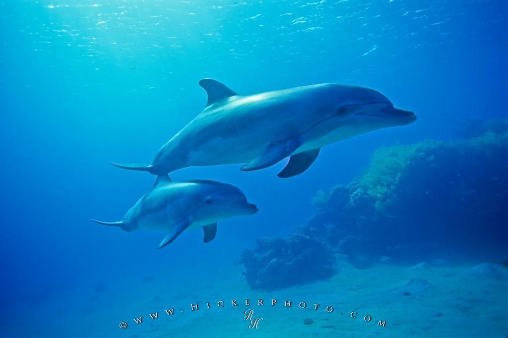
Through my online research I quickly discovered that there was a sparse amount of information on the marine life specifically within the Glamorgan coast so I interpreted this as brief being based on all of the UK Ocean.
Why this is such a great project:
This is a great project for me as it importantly informs me of an issue happening here to my home and extending out to a wider global context through my research.
By being aware of an issue I can get involved and inspire others to take part in meaningful volunteer work or make simple mindful actions that can make a difference to the troubles that both we and marine life are facing.
My next step:
In my most recent blog sharing my development on this project I learnt, explored and crafted many pop-up mechanisms.
The next creative step I took with my project was to develop an illustration concept for my first pop-up page.
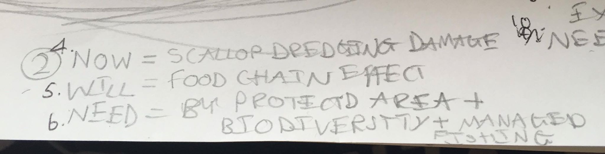
After discovering from my online research that the two main problems of the ocean is litter and overfishing.

I found that litter is of a greater concern to people as its a common, unpleasant and disturbing issue that is with us in our environment almost everywhere you look being most noticeably destructive and regularly brought to light in the news media. Stressed by more news coverage people are therefore more educated and informed about this issue of litter and it’s also something that I was taught about through school.
Significantly the decline in fish species is not taken as seriously as its effects aren’t felt as close-knit to peoples direct health and happiness. In the UK we don’t feel overwhelmingly concerned or threatened by the depletion of fish stocks as we are not dependent on fish alone for survival as we have so much alternative food sources. With far less regular insight on this “distant” issue within the news I believe that people are less informed of this growing issue and convinced by my own experience of having known nothing about this topic before my own self led research and having asked multiple peers too. I feel confident that an informing page based on the topic of overfishing would be the essential and interesting place that I desired to start with to expand my own and others awareness of this more quiet issue.

After I completed this illustration concept I looked at my range of pop-up mechanisms and selected the mechanisms that I felt would work to strengthen and make my illustration overfishing concept more visually striking and interesting in a book form.
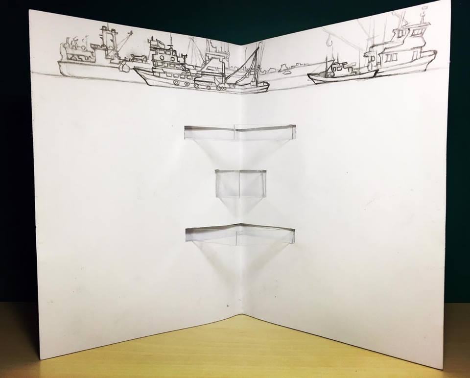
Here is my first design for a pop-up book that I developed on paper:

I planned on using my overfishing illustration concept for the overall background and to use the centre dynamic mechanism for a space to attach paper fish (catch). This mechanism is to give the page a sense of a near and close up perspective of the catch scene with that sense of depth within the catch captured by the fishing boat above. To the right I wanted to place a mass of cut out fish and bycatch attached by strings representing fishing lines connecting to some of the fishing boats for the viewer to interact with to give the page more chaos with this overfishing frenzy to create that distressing atmosphere. I wanted to have on the bottom left of my page a mini ROTATING DISC with yellow and black warning colours to emphasise that overfishing is becoming a serious and threatening problem that could lead to damaging consequences to our species. Along with this I want to also have a SLIDING MOTION pull out feature as a base to the rotating disc to show my own personal body language facially as my own response to this issue I plan on my response to be a distressed pose.
Remember my paper engineering:
SLIDING MOTION:
ROTATING DISC:
I CONTINUED MY RESEARCH TO IMPROVE MY KNOWLEDGE OF THIS TOPIC AND TO BOOST MY MOTIVATION!
Before going ahead with making my pop-up book following the plan I made above I knew how important it is after having learnt from previous project to test things out before jumping straight in for the final piece. Making mock up can inform you so much and can prepare you by learning of an effective approach for the final piece.
Throughout the making of my mock-up pop-up page following the design plan I constructed above. I continued my research by learning more about this topic of interest through watching and listening to fascinating documentaries based on overfishing via YouTube. From the documentaries I was able to access a vast diversity of opinions and perspectives from scientists and fishermen. But this did make me particularly intrigued to wanting to know more about the general public’s thoughts on overfishing to see how much they know about this critical issue and to see how much they care.
For motivation I listened to music that really drew out my passion for protecting the beautiful marine life and helped me imagine the destructive moment of overfishing by connecting myself emotionally to this topic.
The DOCUMENTARIES:
The MUSIC:
Pop-up Page Mock-up Development:

Check out my videos – In these videos I am showing the additional puppet feature I included and the motions you can create:
With this additional puppet feature and of course the fish cut outs on the 3D centre mechanism. I had to make sure that my book could close and reopen effectively with no damage to these paper features.
I did find that the puppet occasional caught on the fish shapes attached to the centre mechanism once the book was folded and reopened, as the puppet can sometime lose its flat shape when left in the centre position where it is bent by the closing of the page.
However I knew that this can be easily fixed by designing a wider and smaller puppet of paper clustered fish with no sharp edges that would easily catch on the other paper forms and laminating this shape so that it won’t bend but lay flat when closing the book.
I then progressed onwards with completing my mock-up pop-up design which finally developed into this outcome:


Here is a video of my completed mock-up of my page design and me showing all the interactive features in action:
From this mock-up of my overfishing pop-up book I was able to establish what works well and what doesn’t. I knew that for the centre mechanism of paper fish biodiversity I wanted to have that pop-up out structure framework made transparent using acetate to give the fish that floating effect of a moment underwater. I didn’t want any of the mechanism framework to get in the way of visibility of my illustrated cut out marine life.
I felt that everything on my page has to be strong and clear with its message to create an instant impact and response from my viewer. It was here that I grew more of a desire to make my page more straight to the point with the idea of removing features of my rather cluttered mock-up design.
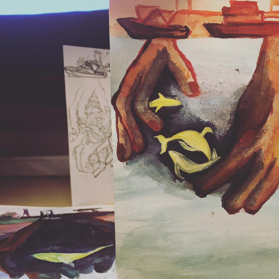
So I wanted a more basic approach with less going on, removing that section of netting and just using my original illustration for this page with the hands grabbing the fish from the ocean and the fisher boats above the sea line. I was also very displeased with the text sections clustering the page, I felt they didn’t work as compositionally as I imagined it would. The text distracting flaps and cluttering locations take away the powerful statement I am making alone visually with my illustration which I always want to enforce as the real enforcer, activist and messenger.
From this stage of thought and development with my project the next step I took was attending a very helpful group tutorial that took place on Monday the 7th of March. The tutorial was attended by my tutor Chris Glynn and new associate tutor Phil Wrigglesworth plus other student illustrators who all shared their opinions and suggestions in response to my presentation.
My feedback I received once I had fully explained my project and my intentions was the idea of creating a survey to take with me to the beach cleaning event that I am going to attend to inform me of the general public’s view about this overfishing topic and most importantly to hear the opinion and experience of the people who were leading the event.
The tutors suggested that I use a quote for each pop-up page in my book derived from my surveys.
This survey would help to support my project by incorporating my journalistic experience with this collaborative aspect of discussion providing me with interesting and useful insight into the general knowledge and people’s feelings towards this topic. Which is always important when you are creating something meant for that exact audience.
So I made two surveys based on the topics: OVERFISHING and LITTER
I made the surveys in a hand out form to take with me on the trip and I also made an online version of the surveys using Smart Survey to share on my Facebook page to reach out to my friends and family. I created my questions with my own curiosity and I grew really interested to listen to people’s opinions about this issue.
My SURVEYS:


In the Tutorial I also shared my new proposal for my project, which I developed after producing my mock-up pop-up page.
Remember my initial proposal:
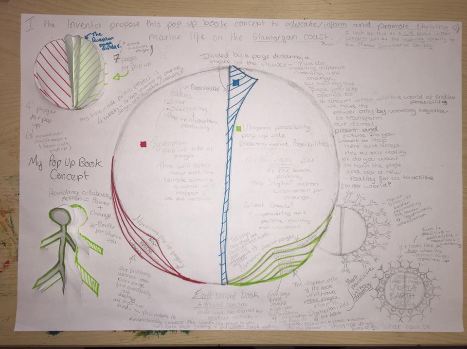
My new proposal:


After sharing my new intention for my project, Chris Glynn who was considering the time aspect of my project suggested to me the challenge of completing three pop-up pages refined and the rest of my seven pages I planned to create just as quick draft proposals. So particularly the refined three pages would show the potential I have with my book effectively.
At the time I felt like this was achievable with the week I had remaining for this project.
I was also warned in my tutorial that documentaries are biased and that the information can be outdated so it would be unwise to use any statistical data from the documentaries.
Beach Clean!
On the 8th March I took part in a really enjoyable Beach Clean event that was a volunteering project led by the Cardiff Student Union Team and not as initially thought as the universities surf club. I travelled by bus with the group of volunteers and went to Ogmore-by-Sea beach where we met up with Tim Wort who works for ‘Keep Wales Tidy’ who really thanked us for coming along and taught us about the litter issue on the UK beaches and the instructions for the beach clean.
My pictures from the day:


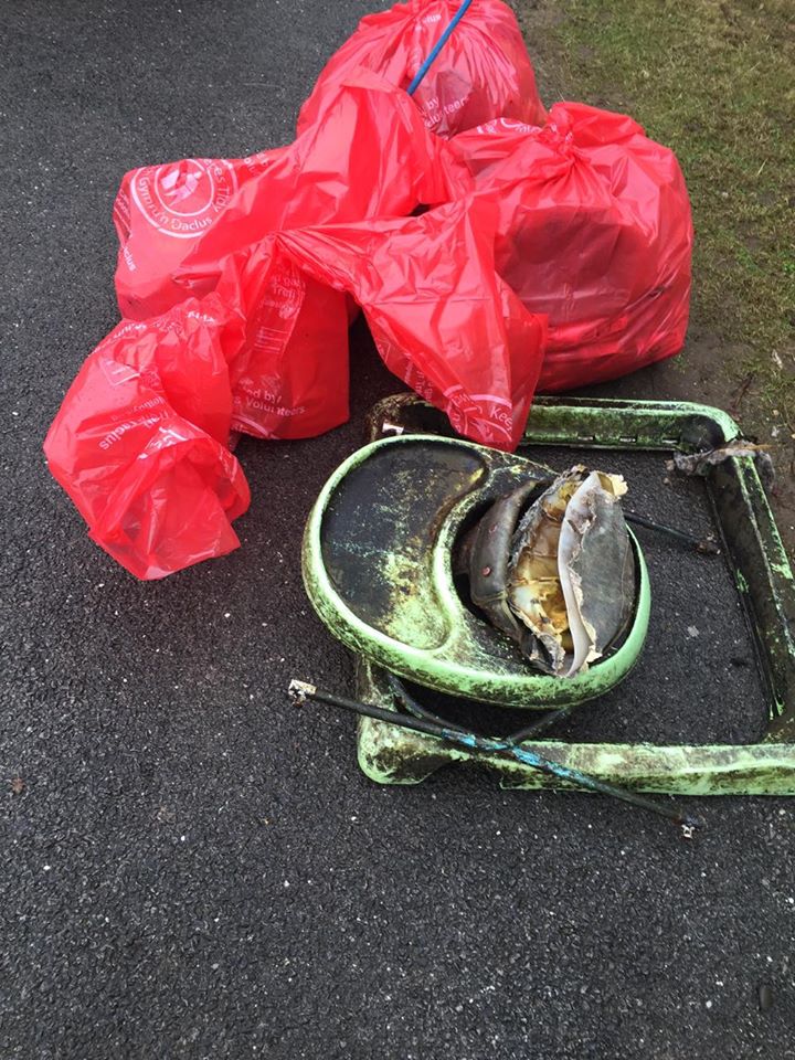


This was my first experience with this type of volunteer work and I have to say I had such a great time at this beach clean and I’m definitely considering going to another event like this. By picking up litter from the beach I am saving the natural beauty of our home and eliminating a potential killer to our treasured marine life. We must never take natures beauty for granted, we need to protect it and we need to look after it with all our love just like we do with our own homes. I made sure to interview Tim Wort who was very knowledgeable about the ocean to gain interesting answers to my survey questions before leaving the beach.
The Development of my First Pop-up Book based on OVERFISHING:


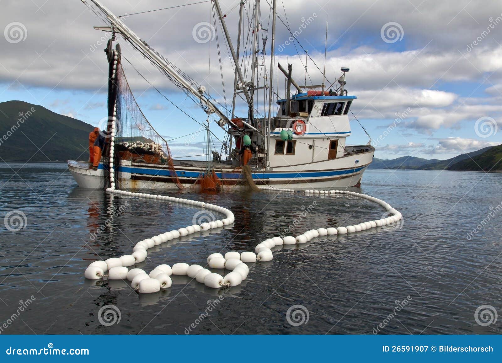
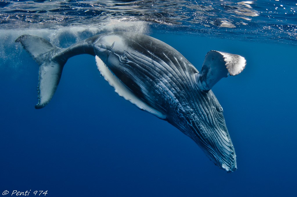
For the animal and boat illustrations I used the internet as a source of reference and research to create a realistic appearance to these features that I desired as I wanted it to be a bold and clear statement and perspective.
For the illustrations of grabbing hands I simply captured and utilised pictures of my own hand in various grabbing poses to again create a clear realistic appearance.
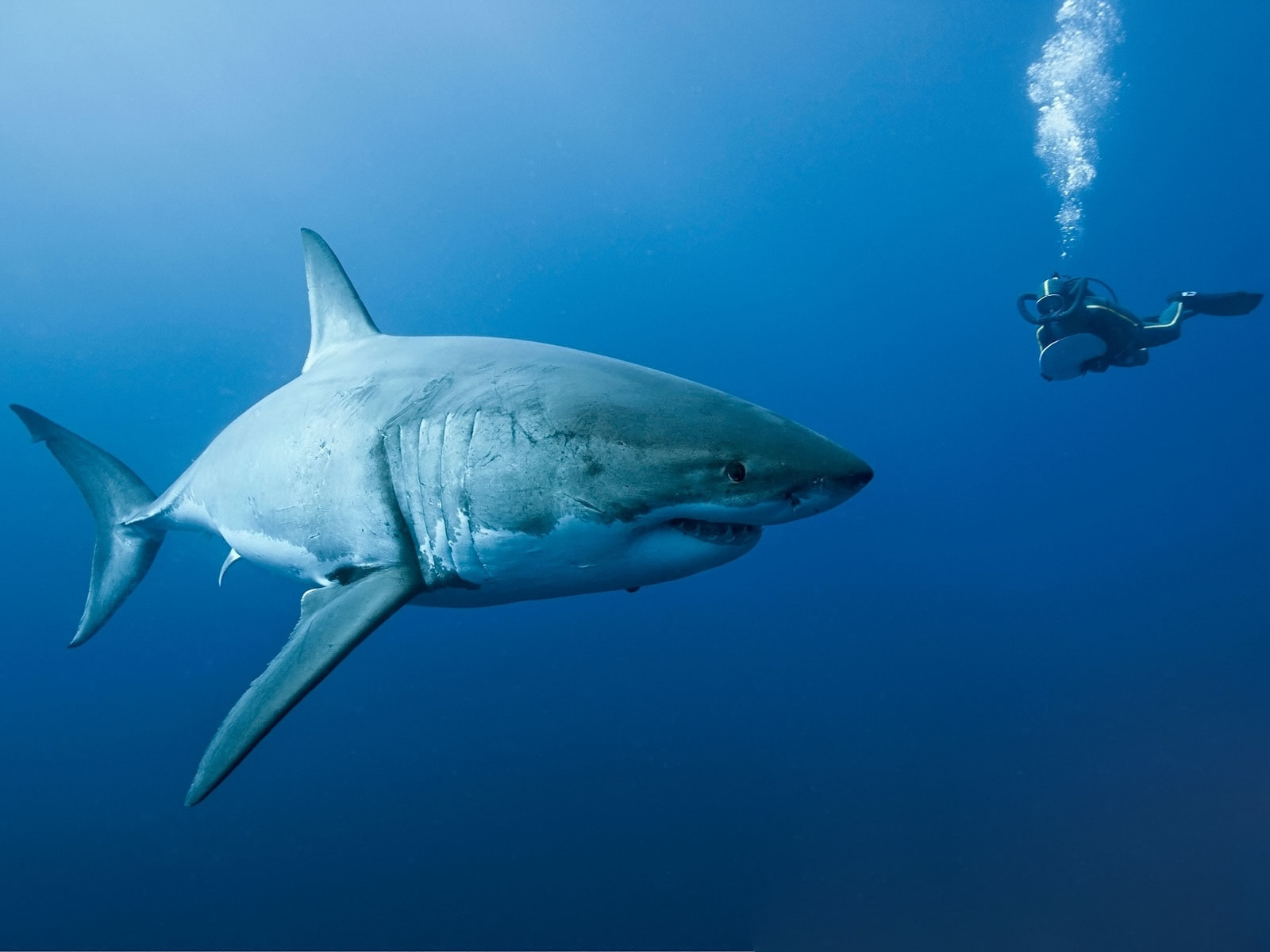
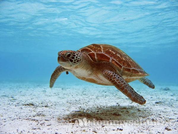
Some of my resources that I sourced from the internet that I used for reference when illustrating my pop-up book:


Various photos I took of my hand/hands to use as reference for my illustrations:


Next step – COLOUR
Before applying the colour straight onto my pop-up page I had to experiment to make sure I get my colours just right. I wanted my colours to be bold and eye-catching.


With my sea animals being like I said “stars in the night sky” and perceived as treasure, precious and beautiful. I believe this idea was influenced from my research from my previous field project where I worked with a group of fellow illustration students on a recent promoting nature project.
What my colours represents:
Yellow reflects happiness and positivity.
Green reflects life.

I believe a world without those two colours yellow and green existing for us today would be a very upsetting and unthinkable world to imagine. I feel these two colours are a powerful source of happiness.


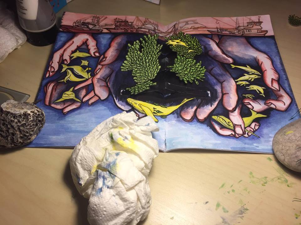


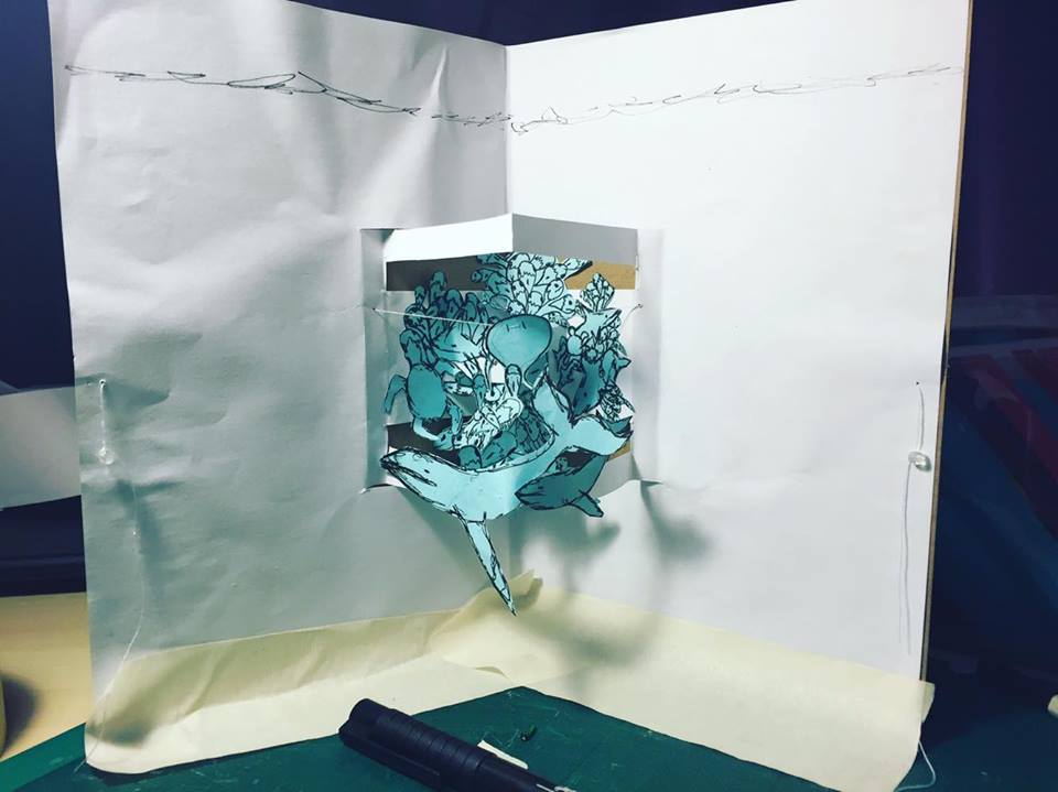
The FINAL OUTCOME:
This video shows my pop-up book based on overfishing completed:


My project takes a final new road:
In the development process of creating this pop-up page designed to educate people about the overfishing issue happening within the UK Oceans. I grew an exciting concept drifting away from my latest intention of a 10 page pop-up book.
The idea stemmed from how much my book wanted to stay open physically due to the sturdy and stubborn material of acetate used for the pop-up mechanism where the book sternly avoided being closed and laying shut. Simply, when you attempt to close my book it only springs back open.
This made it clear that my book refused to be like other pop-up books with their many pages of surprises each shut away at the turn of the page or close of the book. Its wonderful handiwork enclosed away waiting to be revealed but without the intervention of turning a page it doesn’t get seen like it deserves. By learning all those paper engineering mechanisms I discovered how really clever these inventions were and precise in its particularly parts, it really is very tactile work.
My pop-up page however was a singular and serious statement declaring itself as something that must be read and seen immediately. Its open stance empowers its critical importance as it stands strong and proudly presents its self.
My book open speaks with few words and provides a perspective that lays invisible to us, through my book is to see the ocean from an underwater perspective. By standing out from the crowd of pop-up books with a use of only two pages and it being self-standing effectively grabbing my audience in with my eye-catching art I gain interest and with this interest I have facts on the opposite side of the book to inform my viewers in a feed of facts to become informed of this issue.
It was then I realised when I had completed this book that I wanted it to be a singular standing piece informing people of what is happening now to go a long with a similar format of book but based on what we need to do to solve this overfishing problem.
My illustrated vision of my second book:

The idea of this page is to inform people of what to consider eating over the threatened species as an effort to help take the pressure of fishing for common fish species that we are depleting. By doing this together and raising this awareness through my book this could help the common fish stocks to repopulate and grow again.
By creating a set of two pop-up books informing people of the situation now and what we should do about it I have helped the issue gain more an awareness and it is awareness that leads to solving.
From here I was happy with just focussing on the overfishing topic for this project as I felt people knew more about the more visible little issue than they did about this discrete ocean issue that we take little notice too.
Due to the little time I had left to complete this project I was pleased to hand in my overfishing book and my illustrated plan for my final book.
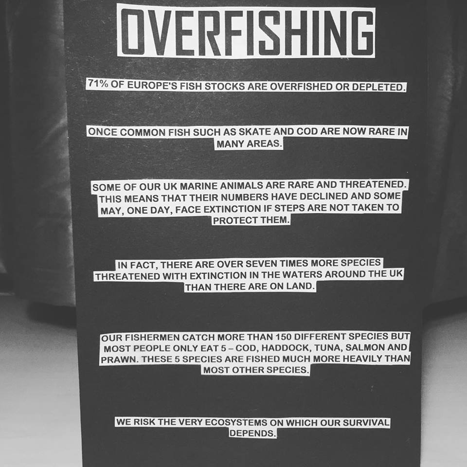
As a third feature to my project submission I included my survey results in this open standing book form following the open design I loved about my completed pop-up book.


This way I am making a group discussion about the issue an accessible timeless piece.
What I think of my project:
I am really pleased with my end result as I know I put a lot of time, energy and passion into this project. I feel that the strongest element of this outcome has to be the single text statement of the opened visual illustrated inside. The single strip of clear capitalised text reading “WE ARE TAKING TOO MUCH” gets straight to the point as clearly and as simply as possible. I am also particularly in love with the format of the book in its presentation being a standing and very eye-catching aesthetic along with its bold colour work. The fact that it effectively stands out and attracts the eye is a success in my effort to bring the issue to light.
I don’t feel unsatisfied with any particular element of my project I’m happy with the outcome as it’s refined and a bold affirming piece.
My Crit:
My critique is the final stage of the project where I simply presented my project to a small group of fellow illustration students and my tutor Chris Glynn. In this 10 minute session I was able to gain fantastic feedback that I always find very useful and a key source of improving myself as an illustrator.
What they like about my project:
The group loved the idea of the open book self-standing format and much preferred my less cluttered outcome to the initial mock-up book. Chris really liked my conversational survey piece form as a feature to my project.
What they didn’t quite like about my project:
- The colour came up as an agreed fault with my overfishing pop-up book as one of my friends said the colours of the intended precious and treasured marine life that I painted in yellow and green reminds them too much of a toxic waste colour!

- Chris also mentioned how my survey piece looked a bit shabby with all the staples I used to secure the pages together and the sign needed to be a lot stronger standing and so it could also work as a handle.
- I was advised that inks would of worked better on the card that I painted onto with watercolours as watercolours did kind of wear down and slightly tear up the card material in areas where I dampened it too much. I haven’t ever used inks for illustrations before so it would be good to practice this medium over the Easter break.
We agreed I need to practice more colour work over the Easter break as I admit I found it tricky to know what colours to pick and worried if I was making the right decisions. I want to feel more confident with colour work and make the right choices!
I admit also that the staples on the survey piece was a rushed job and I should of taken my time with its construction to make it more pleasingly aesthetic.
April 18th 2016 – In response to my advice on how I could improve this work in preparation for the final module assessment:
- I believe my eye-catching and alluring pop-up book would function best in the domain of the public especially placed in clear view in fish markets to aware the consumers of the overfishing issue so they can make informed decisions on which (hopefully) alternative fish they buy. Therefore with every successful influence on purchase I have effectively helped through educating to reduce the pressure of fishing of the threatened species that face the possible future of extinction. This was in agreement via email with a lady who I believe was called Jennie Griffiths who led a marine conference at the University during the Future Generations module in response to my email as I was highly persuaded to email her my work and for her thoughts on this theory of mine. She loved my work very much and thought it was an effective concept and to my surprise Jenny even asked to show my work in an upcoming meeting with my permission to which I allowed.
I would show a print screen of this email but I unfortunately accidentally deleted the email in attempt to declutter my inbox. I really need to be more careful and ‘Archive’ all of my important emails and forbid myself from deleting any from this file.
See my previous related blogs:
My first post based on this 4 week Field project sharing my initial research and intentions for this project:
https://ellenreesblog.wordpress.com/2016/02/27/field-individual-response-a-pop-up-book-project/
My second post where I presented my large range of pop up mechanisms that I learnt from YouTube sources and a very useful book from the library:
https://ellenreesblog.wordpress.com/2016/03/01/pop-up-paper-engineering/


