Words and Colour Project

On the 12th of October (Monday, 2015) I attended a presentation introducing me to the project brief entitled ‘Words and Colour’ run by Anna Bhushan one of my Illustration tutors.

What I heard and learnt from that morning’s presentation:

  • Colour is very important in illustration.
  • Colour wheels are simple tools to help us understand colours and how they are made.
  • Our perception of colour takes place in the mind and not in the eye.
  • Colour is psychological, emotional as well as perceptual.
  • Colour is an important tool to communicate.
  • Palettes are sets of colours and colours next to each other have a relationship with each other.
  • Colours can be gentle, they can create tension.
  • We reach for materials without thinking a lot of the time. I need to be now applying focused experimentation where I think before grabbing the material and I need to THINK before exploring techniques and processes.
  • Colour is a communication of mood.
  • Assumptions of colour for example: leaves are green, sun is yellow, tree trunk is brown, LIMITS the ability to EXPRESS! Explore being out of the Primary School Conditioning. This is one end of the spectrum of how we approach colour.
  • Colours can give a sense of light, interior space, a communication of feeling, atmosphere, time of day, the season.
  • Colour is an important narrative device, it is storytelling.
  • Be abstract.
  • Be specific and precise with your colours that you make, don’t use colours straight out from the tube. MIX COLOURS THEN USE. (Exactly what precise yellow?)
  • Explore saturated and unsaturated colours and see how they sit next to each other.
  • BEWARE of fixing colours with meaning! For example: Red = Danger, Blue = Sad, Yellow = Sunshine, Happy! Experiment with using different colours perhaps a yellow for danger, red doesn’t have to be approached as danger.
  • Use colour as raw emotion, colours depend on the context.
  • Convey information, every illustration has a purpose.
  • You can explore the colours from food substances, found colours.
  • Explore layering colours you can have a go at subtle complex colour print inductions for example screen printing. Perhaps opaque, typically flat colours.
  • I can create sheets of colour and cut them up to apply a montage process. Cutting, arranging, play with composition, fluidity.
  • USE SHAPE NOT LINE. Today look at the brief as “Shape and Colour.”
  • Anna recommends that I buy myself a set of gouache paints – these paints can be both watercolour and oil paint like.
  • Look at how much water can play around with translucency.
  • Explore strange colour relationships.
  • Explore flat and simple with just two colours minimum.

Exploring colour like this will give you inspiration about all the different approaches to illustration and it is a fundamental basic building block and excellent tool of knowledge.

This Colour and words workshop is an opportunity to play and experiment with colour relationships and palettes. I will explore the associations between words and colours and consider how important colour is for visual communication within Illustration. This week I will be basing colour palettes on everyday life and the things that I encounter.

Quotes of the Brief:

“Colour is all. When colour is right, form is right. Colour is everything, colour is vibration like music; everything is vibration” – Marc Chagall

“I found I could say things with colour and shapes that I couldn’t say any other way” – Georgia O’Keefe

“Sometimes I imagine colours as if they were living ideas, being of pure reason with which to communicate. Nature is not on the surface, it is deep down.” – Paul Cézanne

“It is the eye of ignorance that assigns a fixed and unchangeable colour to every object; because of this stumbling blocks” – Paul Gauguin

My First Activity of the Workshop: RESEARCH: ‘Library of Colours’

I and the other group two students had the instruction to go to the art section of the library and browse in the books. I had to find images that I think have an effective colour palette, particularly the following:

  1. An image with a naturalistic or functional colour palette.
  2. An image with an expressive colour palette.
  3. An image with a limited colour palette.
  4. An image with an unlimited colour palette.
  5. An image that doesn’t use any black.
  6. An image that uses flat colours.
  7. An image that uses painterly or textual colours. 
  • I had to then photograph or photocopy my findings.
  • Write a blog post with reflections on how colour has been approached by the artists. Considering how the colour makes me feel and how it communicates ideas.
  • Bring the images and my reflections for discussion at the process seminar on Tuesday 13th of October.

My work from Activity One:

This is a painting by an American painter known as Nelson Shanks produced in 1937 in Italy. I selected this piece to be my chosen artwork that has been created with a naturalistic colour palette as the piece is almost life like looking, sticking to the typical assumptions of colour conditioning. Nelsons predominant use of warm and gentle colours are enchanting yet bewildering with that use of bright, clashing and cold colours that I feel are quite virulent along with those lurking and precarious shadows. This piece communicates the idea of how colours can tell a different story to what might firstly, as I saw it a lovely simple still life nude portrait that was beautiful and alluring but then in time once focused upon turned into a dubious and uneasy mood. Those weighty looking black pearls aren’t the colour of innocence or purity but I feel it provides more of an unsettling feeling to me. Her eyes are very piercingly staring out at me crowded with those cold quite menacing colours that makes me feel perhaps this is a vengeful trap for the seduced person she wishes to allure.
This was an illustration that I found based on Marvel comic characters approached by the artist called Jack Kirby with an expressive colour palette. The colours that I can see appear to me as flat, striking, eye-catching and bold. This expressive variety of valiant colours makes me feel excited, thrilled and drawn into the interesting narratives of each of the characters. This chaotic piece communicates ideas to me such as effectively and intelligently connecting the use of thoughtful and a particular colour palette to match the typical actions and personality traits of the characters. Which Kirby has done so very effectively with the vivid and strong punches of flat hard colours presented in this piece. The bold and vivid colours put next to each other creates a relationship of assertive and forceful personas linking perfectly to the villain fighting, heroic and world saving attributes of these very successful Marvel narratives. I really like the design of this illustration with an artist drawing a comic in the background and the characters vigorously ZOOMING out of the page like an exploding firework of ideas coming to life and out of the page towards me and the viewers with Kirby’s admirable use of punchy, explosive, fun and bright colours applied boldly and with a flat purposeful aesthetic.
This is my chosen illustration with an unlimited colour palette that I found in a book called ‘Cartoon Modern’ written by Amid Amidi and it was the background painting from “Petroushka” directed by John Wilson for Fine Art Films in 1956. I consider this illustration to be the result of an unlimited palette use because of the diverse exploration of colour present in this piece. In this colourful circus and festive like, fun illustration I can see that the artist creates a happy, cheerful and buoyant energy that reminds me of Christmas joy and elation. With a soft, flat and heart-warming aesthetic use of colour palette and method it creates a comfortable, inviting and welcoming sense to me that pleasingly pulls me in to this safe and homely feeling piece. I like how this colour palette gives me nothing but a feeling of good vibes and good energy and creates a Christmas festive jingle of Christmas melody and touching music full of high spirit in my mind as I look at it and reminding me of amazing smells of cooked meats in Christmas markets. The artist’s use of light, diverse, soft and flat colours communicates the idea that I can avoid creating the feelings of threat and danger in this way. This colour palette calms down and evolves the excitement and thrilled energy of the comic piece by Jack Kirby into this more emotive and heart felt sense that I get from this artist’s palette. I know that if I were to change the colours of the piece to cold, eerie and dark colours kept with that soft calmed down look this piece would be transformed immediately from the joyful to a menacing image particularly with those smiling faces everywhere.


This was an illustration entitled ‘The beached white whale (Heath Blubberatus)’ created in 1989 by an artist called Gerald Scarfe that I chose to be my selected limited palette example. I can see that with this grumpy and miserable whale character Scarfe has used a very minimal colour palette of just tones of grey and a soggy brown sad red for that frown. With Scarfe’s minimal amount of colour it works very well with the lack of happy, expressive, uplifting buoyance of life that being expressive can bring out but with this piece it is kept moodily sparse and unostentatious with attitude. This whale simply just isn’t happy at all about being completely washed up bound to be in a position of vulnerability and in need of rescue. The whale’s size is obese and podgy which would make it difficult for his weight to be budged. Which gives an amusing sense of how screwed this whale is, which is quite funny to me as he really doesn’t look approachable what so ever even though he’s going to need that interaction. The Whale reminds me of a typical grumpy old man’s stubborn attitude. This ultimately communicates the idea of thinking and considering the characters MOOD and personality and how I could use colours to carry that across just like Scarfe has done with this illustration. His colour appears briefly washed on linking well to the fussy arrogance of the whale in need of help but possibly having refused it and also linking to the water based setting.
This was an illustration that I found in the library on Monday that didn’t present any use of black within the artists colour palette. The artist has predominantly used pale tones of flat pinks along with striking clashes of the primary colours red, blue and yellow used on the trunks of the palm trees and blue of the sea which really stands out. These conflicting and made angry colours harshen the image and expel the unhappiness of the suggested disserted poor man succumbed by loneliness. The colours of the tree trunks stand out menacingly against his vulnerable soul elated most intensely with the man’s bright white clothing. The colours that the artist has used for the environment just don’t go with the man’s colours of bright white embodiment, yellow hair and pink skin. This makes me feel the presence of his loneliness and uncomfortable situation being very lost and obviously out of place in this environment. This colour palette used by this artist has communicated to me the idea of creating tension and causing a sense of being out of place by clashing colours and tones in contrast to a lone, opposing and pure colour like the innocent white of the embodiment of the sad man emphasizing that sense of being alone and lost.
This is a painting I discovered in the library entitled ‘Die Sechste Posaune (The Sixth Trumpet)’ created in 1996 by an artist known as Anselm Kiefer. I have chosen this piece to be my selected image with a use of a textural colour palette as this painting has a lovely sandy and gritty aesthetic that I adore and feel entranced by. Kiefer has approached this painting with emulsion paints and with a dark, grubby and organic palette. Kiefer has been expressive with the many variations of earth and dirt colours like the parched and arid dry mud and the grains to the moist dark compost mud colour. This painting is speckled and appears to depict and suggest the landscape of an open desert amidst a sand storm or blizzard with all those dark particles populating and polluting the open air. The colours of this painting makes me feel engrossed, inspired and wondrous as I sense no danger just a love and admiration for nature with this piece as the colours are earthy and predominantly light and pleasant. This textual piece communicates ideas of using light and organic colours to evoke my own love for nature most effectively and the speckled approach by Kiefer adds to the lively, heart felt and meaningful love of nature expelled with the expression of stunning small yet polluted dabs of paint that are fragile yet beautiful.
When I was browsing in the books in the library I came across and took a photo of this effective flat colour palette used in the artwork entitled ‘Cat Girls’ created by the artist Malika Favre produced in 2008. From staring this piece I can see that Favre has approached this piece using a limited palette also with the use of only three colours which are red, blue and gold making it quite a simplistic yet eye-catching and striking approach. The colours are particularly captivating with that beautiful and pleasing symmetry and mirroring aspect empowering the cat girls equally. Interestingly I find this authoritarian use of colours highly attractive and effective with gaining the attention of the viewers. The colours in the piece used by Favre make me feel enchanted and confident. This inspiration has communicated to me ideas of using the combination of a flat and limited palette to convey a confidence with my work and sense of assertiveness.


My Second Activity: STUDIO WORKSHOP A: ‘Mixed Feelings’

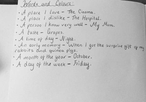
For the first part of my second activity I had to write down my own personal responses to the following list of words in my sketchbook or notebook.

  • A place I love
  • A place I dislike
  • A person I know very well
  • A taste
  • A time of day
  • An early memory
  • A month of the year
  • A day of the week
My personal responses written in my sketchbook. 
My personal responses written in my sketchbook.

I then had to mix a colour that evokes each of the words that I have written down. Being specific about the colour. Play around with different proportions and combinations, opacity and saturation of colour when mixing.

Chosen mixed colour for a place that I love.
Chosen mixed colour for a place that I dislike.
Chosen mixed colour for a person that I know very well.
Chosen mixed colour for a taste.
Chosen mixed colour based on an early memory.
Chosen mixed colour for a time of day.
Chosen mixed colour for a month of the year.
Chosen mixed colour for a day of the week.

On separate pieces of paper make a colour field of each of the 8 colours that I have mixed. It was important to spend the time mixing and considering the subtly of each colour.

Rules:

  • DON’T USE BLACK – use other colours to make dark shades.
  • DON’T USE THE PAINT DIRECTLY FROM OUT OF THE TUBE – YOU MUST MIX EVERY COLOUR THAT YOU INTEND TO USE. Be experimental and explorative.
  • Have fun!
Colour field evoking – A place I love: The Cinema


12351065_10205206177901180_714244977_n
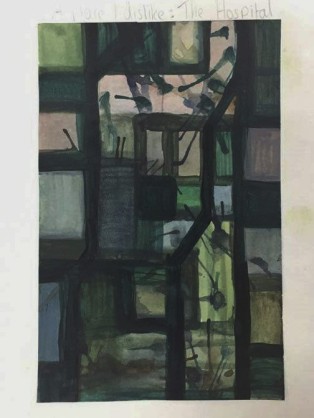
Colour field evoking – A place I dislike: The Hospital
12351145_10205206178301190_1032901808_n
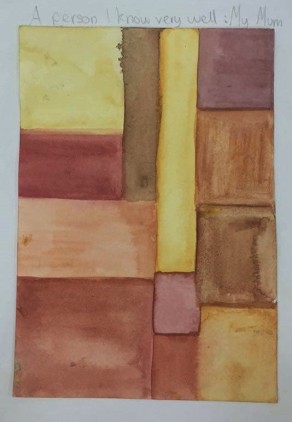
Colour field evoking – A person I know very well: My Mum
12351103_10205206178141186_277441888_n
Colour field evoking – A time of day: Night
12358378_10205206178221188_4927703_n
Colour field evoking – An early memory: When I got the surprise gift of my rabbits and guinea pigs.
12348773_10205206178381192_1768095709_n
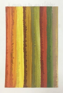
Colour field evoking – A month of the year: October
12380051_10205206177821178_588190657_n
Colour field evoking – A day of the week: Friday
12386671_10205206178261189_613181226_n - Copy
Colour field evoking – A taste: Grapes

My third activity: Studio Workshop B: ‘The Colour of Saying’

Colour Palettes: I had to use my colour pages shown above as a basis to create a series of five possible palette combinations with different colours dominating the field. I could try cutting shapes from them, remixing colours or I could add new colours. I was suggested to play around with various combinations, try out limiting the palette and see how shape and colour affect each other.


Cutting shapes and adding new shapes. Colours of this piece influenced by my original ‘early memory’ colour sheet. Design influenced by my original ‘night’ colour sheet.
Cutting shapes and adding new shapes and colours. Colours of the piece influenced by my original ‘hospital’ colour sheet. Design influenced by my original ‘night’ colour sheet.
12386549_10205206177781177_1680980963_n
Cutting shapes and adding new shapes. Colours of the piece influenced by my original ‘grapes’ colour sheet. Design influenced by my original ‘night’ colour sheet.
12358420_10205206177661174_588531640_n
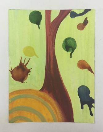
Limiting the palette and cutting shapes. Colours of the piece influenced by my original ‘october’ colour sheet. Design influenced by my original ‘night’ colour sheet.
12355235_10205206177581172_1337880128_n
Limiting the palette, cutting and changing shapes. Colours of the piece influenced by my original ‘hospital’ colour sheet. Design influenced by my original ‘night’ colour sheet.

I was then instructed to take the text extracts provided, cut them up, take single words, phrases or paragraphs and combine them with my favourite colour studies. I had to consider the relationship between the words and colour.

From the provided text extracts I chose to use the text “the champion safe-cracker” for this colour sheet. I chose this text for this piece because it appears to me as being technical and mechanical looking linking to the inner mechanisms of a safe. I can imagine with this colour sheet a complexing puzzle in the process of being mastered by an intelligent and masterful mind with the device pieces moving, interlocking, overlapping and then unlocking it’s great unknown reward with its rainbow of jovial and beatific colours suggesting accomplishment and a successful talent.
From the provided text extracts I chose to use the text “You-haven’t told him?” for this colour sheet. I thoughtfully chose this text for this piece because the various splodges of dark dispersing threatening colours on the page bleeding in an out of each other appear like the socialisation of people gossiping and communicating to one another over someone’s personal account. The text works to suggest that the viewer hasn’t told a man (suggestively in a close relationship) about something yet but something that everyone seems to be all aware about. The outer splodges evoke people listening in to the gossip or rumour. This words and colours juxtaposition puts the viewer on the spot and makes me as a viewer to the piece feel concerned about this uncomfortable situation. The dark colours work to link the typically bad attributes of gossip that lead to rumours, judgments and manipulations or exaggeration of the truth.

Process Seminar

On Tuesday the 13th of October I attended my Process Seminar with my illustration Adverbs group and this time with tutor Amelia Johnstone.

Instead of each student presenting and explaining their work one by one we instead worked in a group to discuss and give feedback on each other’s work and then we would each reveal the concept of the work after our group inputs and unique perspectives which created really interesting results.

I really enjoyed this way of learning from each other as there was a lot less pressure on me to translate and explain my work effectively. I enjoyed sharing my opinions and personal perspectives based on other student’s work and particularly listening to the interesting perspectives offered by the tutor and students to the discussion. It was really intriguing and good fun studying the unique individual creations made by the other illustration students.

Five things that I have learnt from this Seminar:

  1. Colours evoke different feelings and responses from each person.
  2. Sometimes it can be clear and other times it can take time to translate an artwork.
  3. Colour is important because it can give the viewer specific information to perceive things the way the artist intended you to see them or feel.
  4. The longer it takes me to try to translate a piece the less interested I feel.
  5. Colour can provoke feeling more than a black and white image can. It reveals more and it is more impressive to master.

After sharing my ‘Library of Colours’ collection of photograph’s presenting found artwork in the library books that I browsed and that I identified as particular effective colour palettes. My tutor Amelia felt that my choice of the marvel comic piece created by artist Jack Kirby was not an expressive palette as she believes the artist has used a restricted and controlled use of colour.

Marvel piece by Jack Kirby.

After looking into the definition of ‘expressive’:

Effectively conveying thought or feeling.

(Source: https://www.google.co.uk/search?sourceid=chrome-psyapi2&ion=1&espv=2&es_th=1&ie=UTF-8&q=define%20expressive&oq=define%20expressive&aqs=chrome.0.69i59j0l5.2659j0j7)

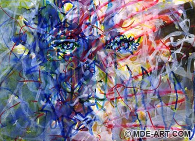
And after researching for ‘expressive artwork’:

abstract-color-face-01
Source: http://www.mde-art.com/art-blog/wp-content/uploads/2008/11/abstract-color-face-01.jpg
polarization of light through the chemicals crystal blur
Source: http://kathymorelli.com/wp-content/uploads/2014/03/Artistic_Blends_Color.jpg
JANE-DONALDSON-4
Source: http://iartsupplies.co.uk/wp/wp-content/uploads/2013/10/JANE-DONALDSON-4.jpg


I grasp now that it really is a combination of the wild and energetic application of colour and mark making as well as that vast amount of colours that really present the use of an expressive palette effect.

Expressive colour palettes in art are very abstract!

Keynote Lecture – When is a nerd not a nerd? When he’s a geek: Exploring the shift in representation of Masculine Identities

On October the 8th (Thursday) I had a Constellation Keynote delivered at 12-1pm in a lecture theatre with other Group A students from CSAD (Cardiff School of Art and Design).

The title of the keynote was: When is a nerd not a nerd? When he’s a geek. Exploring the shift in representation of masculine Identities. 

This lecture was primarily about Masculinity and the following key questions:

  • What makes a man?
  • Why this matters?
  • Why you might care?

This was a topic that I had never looked into before.

“We are all connected; to each other, biologically. To the earth, chemically. To the rest of the universe atomically.” – Neil DeGrasse Tyson

Throughout this lecture I needed to THINK about what connections can I make to my subject and how can the teaching and research be embedded into my own work. This is the purpose of these interesting Constellation Keynote themes, they can inspire my creativity to be based on current and interesting topics.

We looked at:

  • Masculinity
  • The sustained importance of masculinity hierarchy
  • Embodiment
  • Replication of Technical Expertise
  • Reinforcement of Expertise as a facet of masculinity

What are men made of? 

STRONG, AUTONOMOUS, ALONE.

There is no one sense, men are all different.

Constructs around men and women, men at the top.

Hegemonic power: When one group of people enact control over others often with their unconscious co-operation.

Example of people with hegemonic power: People on the UK stock exchange. They are strong, ruthless, competitive, attention seeking, embraces risk, white, porky from wine drinking, successful and middle class. Transnational Business Masculinity (Connell, 2000).

Hegemonic masculinity: Is a set of social practices which promote and make dominance and female subordination and subordination of other men.

Example of someone with Hegemonic masculinity: David Cameron (white, middle classed, top of the food chain)

David-Cameron-Getty-v3
A Hegemonic male David Cameron, Source: http://static.independent.co.uk/s3fs-public/thumbnails/image/2015/01/12/01/David-Cameron-Getty-v3.jpg

Hegemonic male: Bruce Wayne (Batman) character. (Works in finance, rich, managing, wearing a suit not just any suit a really nice suit – Handmade not something from Topman.

Sherlock Holmes – Sheldon Cooper (Big Bang Theory) Experts in their field.

Sherlock Holmes an example of a Hegemonic man in today’s popular culture, Source: https://www.google.co.uk/search?espv=2&biw=1517&bih=741&tbm=isch&q=sherlock+holmes+benedict+cumberbatch&revid=1780129454&sa=X&ved=0CCUQ1QJqFQoTCOzkxY2Nu8gCFccDGgodxLEPfw#imgrc=5dd7RBOXG1uXXM%3A

Sheldon Cooper is more interesting because of the recession – the side kick to the main man kind of role.

Sheldon Cooper from The Big Bang Theory, an example of a Hegemonic man, Source: https://grabhouse.s3.amazonaws.com/urbancocktail/wp-content/uploads/2015/02/sheldon.jpg

‘Wimps, geeks and nerds are at the less masculine end of the male spectrum’ – Connell, 2000

Subordinate Masculinity: Men with less power, lower down the hierarchy.

A McDonalds worker, a Subordinate male, Image Source: http://i.dailymail.co.uk/i/pix/2008/03_04/LukeWorkingWNS_468x356.jpg
A McDonald’s worker, a Subordinate male, Image Source: http://i.dailymail.co.uk/i/pix/2008/03_04/LukeWorkingWNS_468x356.jpg

 MASCULINITY OF THE PAST – OBVIOUSLY EMBODIED

Looking into the Hegemonic Men: Scarface, Die Hard, Speed, Ironman. 

Using Guns, Saving the Worlds, on a Gold Throne, in charge, Drug Cartel, Hegemonic man, shape of their bodies, showing muscles, wearing revealing clothes, quite buff.

Scarface, a Hegemonic man with obvious embodiment, gold ring, smart suit, big impressive gun. Source: https://engineerdog.files.wordpress.com/2014/12/scarface.jpg

Nerds:

Napolean Dynamite, An example of a nerd, Source: http://rack.1.mshcdn.com/media/ZgkyMDE0LzA2LzExLzlmL25hcG9sZWFuZHluLjcyZGJmLmpwZwpwCXRodW1iCTk1MHg1MzQjCmUJanBn/a7b5d49c/256/napolean-dynamite.jpg

Napolean Dynamite example – unskilled, uncool, a school person, lives in fantasy world, subordinate, being a nerd is embodied, uncool hair and clothes, people don’t like him.

Socially and economically incompetent, doesn’t know very much, marginalised, part of the landscape of popular culture.

Geek vs Nerds:

  • Geeks are experts, might be geniuses. Longevity, lots of them, expertise shouldn’t be diminished.
  • Appear socially incompetent.
  • Lack social skills.
  • Don’t need to dress to impress – i.e. Mark Zuckerberg, Brian Cox, Steve Jobs Anti-suit stance – wasn’t important -what he did was important.
  • Geeks might be used pejoratively (Mendick and Francis, 2011) Heads down at school.
Mark Zuckerberg (Facebook) anti-suit stance, real life geek. Source:http://a.abcnews.com/images/Technology/gty_mark_zuckerberg_ll_111101_wmain.jpg
Steve Jobs (Apple) Anti-suit stance, Source: http://cdn-media-1.lifehack.org/wp-content/files/2014/11/o-STEVE-JOBS-facebook.jpg

In popular culture they typically appear as sidekicks (Mission Impossible 3, 2006 – Character Benji, computer geek, the brains, or another example might be Ross from Friends, 1994).

Benji (the brains) from Mission Impossible 3, Source: http://www.aceshowbiz.com/images/still/mi-ghost-protocol02.jpg

HOWEVER,  TODAY Geeks take CENTRE STAGE in POPULAR CULTURE: E.G. THE BIG BANG THEORY (2007) where real science and maths is going on and being incorporated, (just looking at the men) they are not pumped up and are not embodied like Bruce Willis they are instead slim and slender men. The Embodiment of the male characters in the Big Bang theory: t-shirts referencing fantasy words, they often put odd colours together, it’s more to do with their expertise. They are: typically sat at a desk and very knowledgeable on fantasy subjects.

GEEKS – EXPERTS: Sheldon Cooper – Theoretical Physicist, Howard Wolowitz – Aerospace Engineer, Raj Koothrappali – Astrophysicist and Leonard Hofstadter – Experimental Physicist.

(Source: https://en.wikipedia.org/wiki/The_Big_Bang_Theory)

Looking at the men only, Big Bang Theory Cast, Picture source: http://look-like-tv.us/wp-content/uploads/2014/07/the-big-bang-theory.jpg
Bruce Willis in Die Hard, Photo source: http://www.diegesismagazine.com/uploads/1/1/3/0/11300619/4647764_orig.jpg

Real life Geeks: Mark Zuckerberg (Facebook), Brian Cox.

Geeks have now gone on PRIME TIME TV – BBC Quiz shows on BBC TWO, TOP TELEVISION CHANNELS AT TOP TV WATCHING TIME OF DAY – The Big Bang Theory put on in the evening for everyone to consume. They are not in the background, now subordinate men we see often. 

The implications of representing men as geeks? – SCIENCE DRIVES THE NARRATIVE – suggests a shift in representing male power from body to mind. 

From Body, Source: http://themombuzz.com/wp-content/uploads/2009/12/eli-email.JPG
To Mind, Source:http://robwatsonmedia.net/wp-content/uploads/2014/11/o-mind-uploading.jpg

Embodiment going from suits to t-shirts.

Christian Bale (Batman) Character in fancy very smart suit. Source: https://s-media-cache-ak0.pinimg.com/236x/a4/9f/1a/a49f1ad7575c0dee9703161dd9483b9e.jpg
Sheldon Cooper from The Big Bang Theory wearing t-shirt, Source: http://vignette1.wikia.nocookie.net/bigbangtheory/images/d/d3/Sheldon_on_the_couch.jpg/revision/latest?cb=20100511171409

At the end of the lecture we covered: WHY MIGHT WE CARE ABOUT THIS CHANGE?

  • Raises importance of ideas about gender.
  • Gender impacts on our daily lives, and is a cultural construction.
  • Gender in Art and Design.
  • Subject in itself.
  • Representation of gender.

My Response to this lecture:

I really enjoyed listening to this lecture.

I like how men that used to be seen as having a subordinate masculinity like the geeks are now in the spotlight in today’s culture in comparison to our past culture and the past views of represented qualities that identifies what a man is made of that originally put the geeks at the bottom of the hierarchy. It’s truly fascinating to see the changes in popular culture over time, we all like a change, especially when it’s implicitly for the better which I feel it is in this case. I feel a sense of equality, change of respect and judgment to masculine identity is spreading outside the bubble of the wealthy middle class business men image dominantly and statically seen at the top of the hierarchy opening itself to diversity which is beautiful.

My First Seminar

On Tuesday the 5th of October I had my first group tutorial seminar session with Chris Glynn my tutor in my Adverbs group that I was allocated in.

The first task that we did was simply to introduce ourselves and to share our interests to everyone in the group. Annoyingly I got nervous about this and didn’t do too well at actually talking about what interests me as my mind went blank. But I did after the session email Chris and let him know exactly what I am actually interested in as I was nervously very brief at the group chat as I only said I was interested in Culture and Children’s book illustration when deep down theirs other things that interest me much more and things that I’m more passionate about that Chris could guide me with for future projects.

The Email I sent to Chris and for me to remember:

Hi Chris!

Yesterday I attended the Seminar Adverbs session and I was randomly nervous talking to you and the group about what I’m interested in and I just wanted to inform you better as I saw you making notes.

My Interests: 

MYTHOLOGY!

Tales. 

Fantasy Art

Art made completely from imagination. From dreams, visions, nightmares.

Invention of otherworldly places and creatures.

Dark art with hidden narratives. 

Horror – creepy stuff. 

The unknown! What’s at the bottom of the deepest oceans, Is their other life in space?

Symbolism.

Different cultures and traditions. 

History of the planet and people. 

Using Colour! Making people Feel!  

Also at the Seminar I understood more fully what collages were explicit and implicit.

Remembering that explicit means: stated clearly and in detail, leaving no room for confusion or doubt.

Implicit: Suggested though not directly expressed. 

I also learnt that the best/most popular/most successful works were the collage’s that made people move their diaphragm muscles/LAUGH. 

Words and Images Project

On the 5th October (Monday) I was briefed on my new project called ‘Words and Images.’

Building on project work including 50 Artefacts, From Mind to Mark and Primary Research, this one-week project explores dynamic relationships between words and images, through considered and imaginative research and composition. It’s the beginning of an exploration which will continue through the term and throughout my practice on the course.

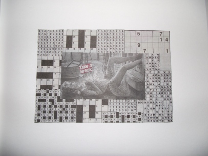
We started the project by working with three kinds of communication on the page: messages to others; conversations; inner monologue. I had already experimented with finding texts and adding them to my natural object compositions. This time I was finding and selecting words and images and combining them for deliberate and chance effect. I continued to reflect on explicit and implicit meaning.

Explicit: Stated clearly and in detail, leaving no room for confusion or doubt.

Implicit: Suggested though not directly expressed.

This project is an opportunity for me to combine words and images in experimental ways, and to make and consider new possibilities for my creative processes and research which I can deploy in longer projects.

For this project we started low-tech using hands, scissors, glue and paper. 

Activity 1 was ‘Collage Messages’ where I had to start by choosing a portrait or landscape format, A5 maximum size plain white paper or card. I has to make six to eight collages the same size, on separate sheets, using words and images cut out from magazines/newspapers. The edge of the paper was my border, not a drawn outline, so I had to cut the paper or card to the right size before I started. I had to decide on the communicative purpose of each collage before I made it, as I make it, or afterwards. I had to work from the following list:

An invitation, a warning, an apology, a fantastic offer, a secret, a weird theory, a recipe or set of instructions, a misleading statement, a downright lie or a rumour. 
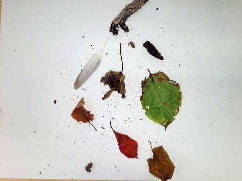
I also had to experiment with juxtaposing the images and text so that they are:

Saying the same thing, contradicting each other, in harmony, interwove, fragmented, colliding, entering/leaving the page, echoing and mirroring, fighting, overlapping or moving together. 

I was advised to practice starting with the text then adding the image, and vice versa. Then practice combining the text and image at the same time.

Here are my Collage Messages:

Collage Message: An Instruction.
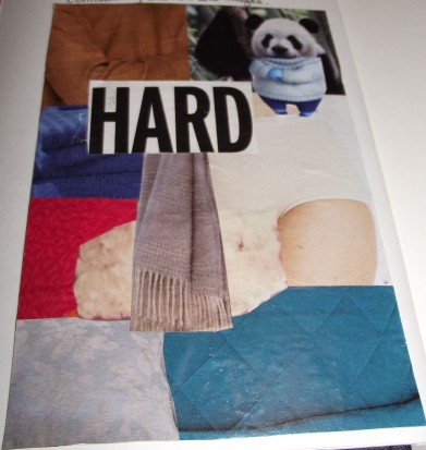
Collage Message: A Weird Theory.


DSCF8109
Collage Message: A downright lie.
DSCF8111
Collage Message: A warning.
DSCF8113
Collage Message: Contradicting the text and images.
DSCF8103
Collage Message: Good Advice.
DSCF8115
Collage Message: An Instruction.

Activity 2 was the Directed research: Illustrated Conversations Task.

For this task I had to pair up with someone from my Illustration class and firstly identify a good place around campus to have two 10 to 15 minute conversations. Our conversations could be about: a.) the 101 Ideas Display; b.) the research processes we’ve explored since Induction Week and what we’ve learnt from them; c.) the books we took out of the library last week and what interested us about them.

Throughout the conversation we had to take visual notes as we went a long, it was best to have A do most of the talking, B does the question and makes visual notes (10-15 mins) then vice versa.

If we ran out of things to talk about we could form another pair and repeat. As I was making visual notes with my group conversation and my pair conversation with my friend Panumas I had to consider carefully where to place them in relation to the text.

My Illustrated Conversations Work:

My Illustrated conversation I completed in a group chat with about 8 other illustration students in level 4. It was a good laugh.
My Illustrated conversation with my new friend Panumas.

The final task of the day was the Inner monologue which I had to complete with my remaining time, in a quiet place, record a conversation with myself on paper or on my phone about the day’s activities. If I like, I could use automatic writing. Lined paper is recommended. I had to also find magazine images and newspaper headings to illustrate or punctuate my words, considering carefully where to place them in relation to the text.

Here is my Inner Monologue (review of today’s activities):

My Inner Monologue of today's activities with a touch of collage!
My Inner Monologue of today’s activities with a touch of collage!

Primary Research Project

On the 28th of September (Monday), I continued to develop the work from Mind to Mark and 50 Artefacts in Time.

The day broke down into 3 activities.

Me being in Group 1 started with the Library Research task where I had to visit the Art and Design section of the Learning Centre (2nd Floor). Find out what kinds of books and films are in the room. From the shelves (not the search engine) choose at least two books to take out: an artist monograph and a book about drawing/visual composition that interests me.

These were the books that I picked out:

A Closer Look – At the art techniques of Patrick Woodkoffe, (Paper Tiger)

&

Henry Moore Drawings, Written by Kenneth Clark

Then I had to go to the Health Sciences or Management sections of the library and take out at least one book about a subject outside my normal interests for example: feet, microscopy, psychology, bio-mimicry, entrepreneurship, speech therapy, etc.

This was the book that I picked out from the Health Sciences section of the library:

Evolution in Action, (By Thames and Hudson), Text by Jean-Baptiste De Panafieu and Photographs by Patrick Gries. 

I then brought the books back to the studio.

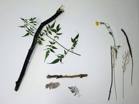
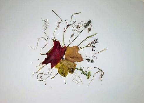
My second task was simple, quick and fun and called the Natural Composition Exercise with found natural objects.  This is where we had to place the natural items on a sheet of A2 plain paper thinking about composition for example: How should it be put together so it’s aesthetically pleasing.

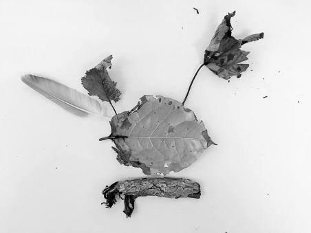
My Squirrel form on a branch (1 Min)
12115511_1694819827440545_1000425881267589950_n
(Black and white version of the original) – My Squirrel form on a branch (1 Min)
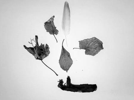
(Black and white version of the original) – 1 minute composition idea with found natural forms on paper.
12072785_1694819920773869_8717357734926729025_n
1 minute composition idea with found natural forms on paper.
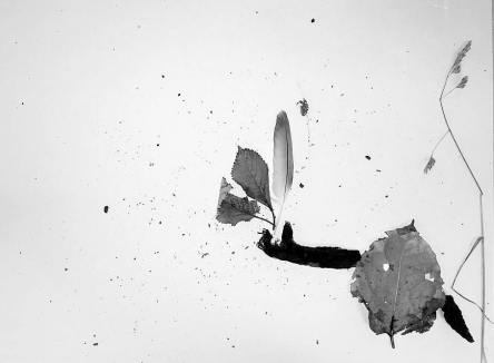
1 minute composition idea with found natural forms on paper. Arm dramatically dropping natural forms concept.
12108955_1694819830773878_5021278665257235168_n
(Black and white version of the original) – 1 minute composition idea with found natural forms on paper. Arm dramatically dropping natural forms concept.


Then 1 considered 10 minute natural composition:

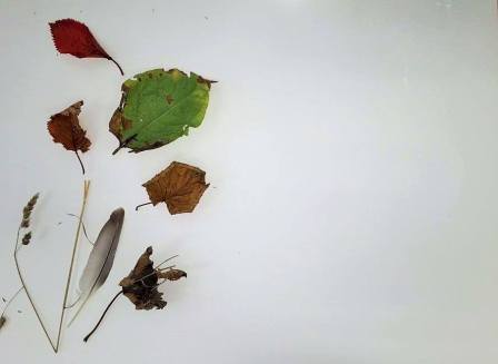
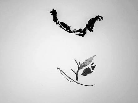
This is a photo of my considered 10 minute composition with natural found objects that I made in the studio. These are two pieces of wild grass that I actually just fiddled with in my hand and then dropped it onto the page and immediately saw two characters running. I simply and carefully moved the grass pieces to a more persuasive positioning only slightly as the way it landed did most of the work for me and this one ended up being the fastest one that I completed yet most accidental but pleasing. Amazingly this one really did come down to chance.
(An edited and improved photo of the original) – This is a photo of my considered 10 minute composition with natural found objects that I made in the studio. These are two pieces of wild grass that I actually just fiddled with in my hand and then dropped it onto the page and immediately saw two characters running. I simply and carefully moved the grass pieces to a more persuasive positioning only slightly as the way it landed did most of the work for me and this one ended up being the fastest one that I completed yet most accidental but pleasing. Amazingly this one really did come down to chance.


Some extra 1 minute natural compositions that I did:

1546211_1694819910773870_6732498946194969516_n
1 minute composition idea with found natural forms on paper.
10487220_1694819824107212_1801618018813735826_n
1 minute composition idea with found natural forms on paper.
11218714_1694819820773879_8557117165980352455_n
1 minute composition idea with found natural forms on paper.
12074586_1694819957440532_1425423978117543891_n
1 minute composition idea with found natural forms on paper.
12079167_1694819810773880_460893744142349513_n
1 minute composition idea with found natural forms on paper.
12079171_1694820034107191_1475584487956755614_n
1 minute composition idea with found natural forms on paper.
12079185_1694819817440546_7678508544592362060_n
1 minute composition idea with found natural forms on paper.
12079289_1694820027440525_484277156275888123_n
1 minute composition idea with found natural forms on paper.
12096631_1694819927440535_389845009632232770_n
1 minute composition idea with found natural forms on paper.
12105894_1694819947440533_1224414756376324696_n
1 minute composition idea with found natural forms on paper.
12108122_1694819950773866_6657411178759150807_n
1 minute composition idea with found natural forms on paper.

Here are pictures that I took of the natural compositions made by other students that I liked:

12042888_1694817350774126_4092699012741648139_n
This composition was made by my friend Markos. 1 minute composition idea with found natural forms on paper.
12047207_1694817347440793_5647946771439152423_n
This composition was made by my friend Markos. 1 minute composition idea with found natural forms on paper.
12074551_1694817914107403_8583506059206593307_n
This composition was made by my friend Markos. 1 minute composition idea with found natural forms on paper.
12074985_1694817360774125_884853086368177018_n
This composition was made by my friend Markos. 1 minute composition idea with found natural forms on paper.
12075071_1694817340774127_6555444059707490116_n
This composition was made by my friend Markos. 1 minute composition idea with found natural forms on paper.
12106750_1694817364107458_6480153181626079292_n
This composition was made by my friend Markos. 1 minute composition idea with found natural forms on paper.
12108252_1694817907440737_6810771444445510921_n
This composition was made by my friend Markos. 1 minute composition idea with found natural forms on paper.
12115755_1694817354107459_5310153037757107444_n
This composition was made by my friend Markos. 1 minute composition idea with found natural forms on paper.
12143297_1694817344107460_707604783900779312_n
This composition was made by my friend Markos. 1 minute composition idea with found natural forms on paper.
10906459_1694818497440678_5890771184198363993_n (1)
1 minute composition idea with found natural forms on paper. Made by another student whose work I liked.
12043183_1694817777440750_4912408946028407242_n
1 minute composition idea with found natural forms on paper. Made by another student whose work I liked.
12079604_1694817367440791_475031535396291801_n
1 minute composition idea with found natural forms on paper. Made by another student whose work I liked.
12106822_1694817857440742_5108708472073841044_n
1 minute composition idea with found natural forms on paper. Made by another student whose work I liked.
12107837_1694817370774124_840761993501387385_n
1 minute composition idea with found natural forms on paper. Made by another student whose work I liked.
12107156_1694817964107398_7554921230980349870_n
1 minute composition idea with found natural forms on paper. Made by another student whose work I liked.
12115427_1694817860774075_334431224622477297_n
1 minute composition idea with found natural forms on paper. Made by another student whose work I liked.
12079108_1694817774107417_8897016080936184906_n
1 minute composition idea with found natural forms on paper. Made by another student whose work I liked.

My Own Words to Draw by List

Smearing, Smudging, Fast, Slow, Intense, Dramatic, Shy, Wiping, Savage, Gentle, Tender, Tame, Mellow, Lively, Energetic, Buoyant, Reckless, Squishing, Cautious, Fussy, Conscientious, Fastidious, Finicky, Angry, Furious, Scratching, Fluffy, Simple, Subtle, Curly, Fierce, Beefy, Bulky, Brawny, Careless, Abrupt,…

These words will help me to develop a creative habit which can help me to develop my core research skills as an illustrator. I will be encouraged and expected to continue with similar, self-directed exercises throughout the year.

‘From Mind to Mark’ Practical Research Project

On the 28th of September (Monday) I was issued a Brief entitled ‘From Mind to Mark.’

The brief came with this interesting quote:

“Teach the pupil that first you make one mark on the paper, then you make another. And the significance of these two marks is the relationship between them – which is a third, invisible mark.” – David Jones.

For phase one of the practical workshop I was to make linear and textural marks from a variety of natural objects that I had found using the following list of words to draw by as stimuli to explore different mark-making energies:

Searching, pulling, gliding, dragging, twisting, dabbing, rolling, loosening, inquisitive, caressing, agile, wild, meticulous, warm, convoluted, secretive, deliberate, bold, flamboyant, dusty, detached, damp, vegetal, earthy, fleshy, wobbly, crinkly, feathery, fiery, precise, insistent, intense, muted, decaying, awkward, flickering, swift, brash, noisy and ebullient.

Plant material was ideal but I could also use clothes, fabrics, hair, fur, food… whatever natural forms and textures where to hand. As in my 50 Artefacts work, I was to be aware of contrasts and sympathies between marks.

This is a picture of my work completed for phase one of the workshop. I really enjoyed feeling and discovering energies from the natural materials that I collected and I loved to translate those feelings and interpretations onto the page in an expressive way with my media. I particularly liked the lack of pressure with not copying and pasting the object onto the page to an impressive perfected look with my illustration but to instead illustrate the energies I felt which made it quite abstract and personal that made me loosen my drawing muscles and made me go wild and playful with this piece.

I was then to complete phase 2 of the workshop which involved me cutting out some of my natural lines and marks from the phase one exercise using my scissors, scalpel and cutting mat. Around four to six was advised to start with. Then on a large, clean rectangular sheet of paper I arranged my marks until the composition felt right. I was then to take a photograph of this composition.

This picture shows my work/ideas in stage two of the workshop. I was moving about and testing with composition of my favourite marks cut out from my phase 1 work onto a clean sheet of A2 paper.
This picture shows my work/ideas in stage two of the workshop. I was moving about and testing with the composition of my favourite mark cut-outs from my phase 1 work onto a clean sheet of A2 paper.

On to stage 3 of the workshop I had to reflect on what the composition could mean (e.g. is it a narrative, a map, a set of instructions or clues, a situation or landscape, a dance?…) and introduce relevant photocopied or handwritten text, ensuring the text and image speak to one another and are in balance. I was to treat the text as part of the composition, paying attention to its weight and density, and being careful with negative space.

Here is what I came up with having abandoned my original composition ideas from phase 2 for some new ideas.

This is my copy of ‘War Horse’ a beautiful, epic and emotional book written by Michael Morpurgo. I brought this book into the studio with me to take text from the novel for phase 3 of the workshop.
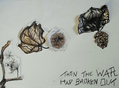
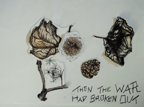
Text taken from the book War Horse written by Michael Morpurgo 'Then the war had broken out.' For this text I had to think of violence, turbulence, dramatic explosive action.  For this one I envisioned deadly soldiers flying down with parachutes arriving to attack.
Text taken from the book War Horse written by Michael Morpurgo ‘Then the war had broken out.’ For this text I had to think of violence, turbulence, dramatic explosive action.  For this one I envisioned deadly soldiers flying down with parachutes arriving to attack.
Text taken from the book War Horse written by Michael Morpurgo 'Then the war had broken out.'
Text taken from the book War Horse written by Michael Morpurgo ‘Then the war had broken out.’
Text taken from the book War Horse written by Michael Morpurgo 'Then the war had broken out.'
Text taken from the book War Horse written by Michael Morpurgo ‘Then the war had broken out.’
Text taken from the book War Horse written by Michael Morpurgo ‘… this is the scruffiest, dirtiest, muddiest ‘orse I have ever seen.’ I built a horse with my cut-out marks and the mud colours worked well with the text.
Text taken from the book War Horse written by Michael Morpurgo ‘I was torn with anxiety.’ When things become overwhelming and claustrophobic with anxiety that it paralyzes.
Text taken from the book War Horse written by Michael Morpurgo ‘Then the war had broken out.’ For this text I had to think of violence, turbulence, dramatic explosive action. For this one I envisioned deadly soldiers flying down with parachutes and background explosions in the top left.
Text taken from the book War Horse written by Michael Morpurgo ‘Then the war had broken out.’ For this text I had to think of violence, turbulence, dramatic explosive action. For this one I envisioned deadly soldiers flying down arriving to attack. This was my chosen final collage which I attached the cut outs to the page with glue and put safe inside my portfolio completing the workshop.

I found this workshop really playful and interesting. 

The Aims of this Project:
This work will feed into Words and Images in Week 3, and is designed to help me with the following:

Skills:

  • Identify and source research materials and undertake considered and imaginative experimentation employing a range of methodologies.
  • Acquire practical and theoretical skills that enable the creation of images within a safe working environment.

Context:

  • Challenge and expand my own preconceived notions of what it means to illustrate.
  • Develop the capacity to interpret visual stimuli and ideas through combinations of words and images.

Ideas: 

  • Manipulate ideas in a challenging, playful and creative manner.

’50 Artefacts in Time’ Project Conclusion

I enjoyed the opportunity of creating conversation and illustration with students within my induction week and being surrounded by artworkfascinating history and the beautiful outdoors. The Museum trips where insightful and exciting. I found myself learning a lot of techniques developing my practical skills through experimentation and I stimulated ideas to try out through listening, seeing artworks in person, creating conversations and seeing my tutor Chris Glynn’s artefacts example piece and other students work. However I did find it boring and tedious at times as I worked too much with black on white throughout the project. To solve this next time I will bring colourful dry media such as coloured pencils and oil pastels to include more colour studies from first hand observation. I would also experiment more with changing the grounds for my illustrations.

As it’s been suggested to the illustrators, I will be keeping my 50 Artefacts work in one sketchbook as a nice singular file of work to look back on or to use again.

Carrying on with the ’50 Artefacts in Time’ Project

On the 26th September (Saturday) I revisited the National Museum of Wales to complete more observational drawings of Artefacts (man-made objects) for my first project ‘50 Artefacts in Time.’ Again I explored and experimented with various media and techniques, whilst keeping in mind the suggestions from the briefing such as drawing from various viewpoints and angles to achieve different perspectives and testing with different ways of seeing. This task is designed so that I explore media and techniques and to obtain and to understand primary research.

Primary Research Definition:

Experiments, investigations, or tests carried out to acquire data first-hand, rather than being gathered from published sources.

(Source of Primary research definition: http://www.businessdictionary.com/definition/primary-research.html#ixzz3nu7UDPeP)

Secondary Research Definition:

Secondary research (desk research) involves gathering existing data that has already been produced. For example, researching the internet, newspapers and company reports.

(Source of Secondary Research Definition: http://www.bbc.co.uk/schools/gcsebitesize/business/marketing/marketresearchrev3.shtml)

My work:

Mixed media studies of artefacts, created on the way to the museum, outside of the museum and inside the museum. I enjoyed adding my own ideas of what I imagined was being said or thought in Joshua Reynold’s painting ‘Charlotte, Lady Williams – Wynn and her Children’ and with the statue in the park opposite the museum called ‘Girl’ by Robert Thomas as I imagined it as a victim of boredom. This is how I translated the artwork from looking at them visually in front of me.
With these mixed media drawings of artefacts that I created within the National Museum of Wales, I explored various transitions of viewpoints and I zoomed in to get a closer perspective. Adding wet media later when I was at home.
Mixed media observational drawings completed within the museum. Using the suggestion from the briefing I learnt from drawing the same artefact more than once but using the media in a different method shown with the otherworldly pot contrasting studies (bottom left). I created my first ever drawing using a method of drawing known as circulism shown to the bottom right which was great fun. The multiple studies of the piece entitled ‘A Young Fawn’ also helped me unravel energy and hidden narratives in time.
Here I changed and documented the various angles of my view of Winifred Turner's Earthenware piece named 'A Young Fawn' created in 1929. I stood their scanning and scrutinizing the charming piece. I also zoomed in and illustrated a close up of the Fawn.
Here I changed and documented the various angles of my view of Winifred Turner’s Earthenware piece named ‘A Young Fawn’ created in 1929. I stood their scanning and scrutinizing the charming piece. I also zoomed in and illustrated a close up of the Fawn.
I found this drawing technique known as circulism to be really enjoyable and out of the ordinary.
Mixed media studies: Pencil, pen and soft pastels. Close ups, cropping, staring and admiring.
I saw beauty without the society’s ideology of the perfect female form with this sculptured piece.
Mixed media studies and definitely an interesting hidden meaning of the silver sculpture to the bottom right entitled ‘Fractured’ by Kevin Grey. It was inspired by the claustrophobic working conditions of coal mining and it refers to a coal mining accident where four minors died. The four clear piecing’s of silver plates in the sculpture is linking to the number of people that died within the accident but at first glance and without reading the description about the piece I had no idea that it was based on a coal mining accident and life.
Mixed media studies and I followed a guideline on the briefing that mentioned changing the grounds that I worked on. So I used black card on one page and I tea stained the other. I feel the tea stain tones of sepia colours reminding me of aged book papers works well with the historic theme of artefacts discovered within the museum.
Soft white pastel outline drawing on black card based on a small bronze sculpture entitled ‘Satyr on a seahorse’ produced in the 17th Century. Full of character and mythological charm and wonder.
I love to wash the ink around taken from my fluid pen drawings later on after the museum where I am able to bring out wet media. Bringing out the shadows subtly created a more three dimensional and impressive aesthetic.
This was a jelly fish sculpture made from silver that was impressively supporting its big bulky body using it’s carefully placed and constructed arms. I used a black pen for this drawing and later tried something totally different by creating a wash for the background of the piece and not typically working within the subject itself. I also had the idea of drawing some parallel line work for an interesting effect for the surroundings of the jellyfish which I really like.
Here is the final page of illustrations completing the ’50 Artefacts in time’ project. On this page I created a variety of outline drawings and experimented again with different perspectives like altering the angle, cropping, focusing and zooming.