Local Library

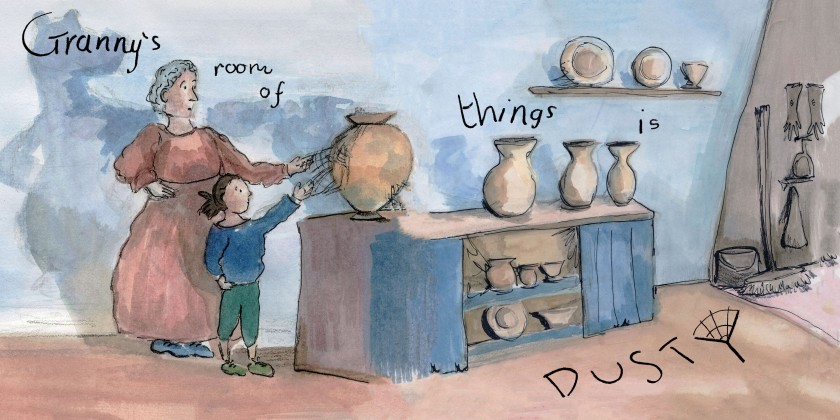
In search for example children’s books I have been to the local Llandaff North library to review the short narratives and illustrations.

I picked out four books from the children’s books section that I was drawn too from the imagery and titles of the books.

30704172_10211112528396251_6824417920529989632_n

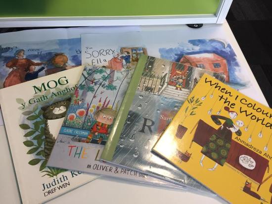
The MOG book I immediately recognised for its acclaimed story work and illustrations. Although I didn’t know the Welsh language I simply used the heavy use of imagery to understand the story to which I could make good sense of being the irritating yet loveable and heroic MOG cat that he was in this story.

This research was targeted towards combatting my areas of difficulty around designing my front and back cover, copy right page, fonts and word and image layouts.

I was also taking inspiration for future work on self writing another story for my future children’s book.

This book entitled ‘When I coloured in the World’ written by Ahmadreza Ahmadi and illustrated by Ehsan Abdollahi was a beautiful read and experience. I loved the repetition and the act of inspiring change with ideas and action.  This is a book of shining hope and empowering the reader to take control and take action.

The illustrations were colourful and extraordinary. This book layout employed a separate page for text and image. This way I could really take in the meaning of the words and the image into two experiences in harmony with each other. I came away feeling particularly happy from reading this book that is important for both children and adults to encourage a healthy and happy mental health.


Another book that I really enjoyed and thought was a simple and a relatable book was called ‘RAIN’ written by John Usher and designed by Genevieve Webster.

It is interesting to see the collaborations of authors and illustrators asI have interest on forming such future partnerships myself.

I loved this book because it reminded me of the pain of my severe boredom as a child stuck indoors because of the bad weather. I liked how imaginative the ideas of how much fun there is to be had out of playing in the rain as the child expressed to his granddad who sensibly had them wait to go outside until the rain had stopped. The joy in the water left over by the rain had been worth the wait in the end and it had been a rewarding experience for both reader and character.

From this research I have gathered an idea of formats that can aid me with my own childrens book development.


Hand Drawn Text Experiment

The images below show my experiments with combining my working images from my self-written and illustrated children’s narrative combined with my hand drawn text.

Front cover experiment:

front cover exp3
I definitely like the use of hand drawn text for the front cover as it has a lot of character and an interesting authentic quality that makes it unique. The few words also make it powerful and impactful and as it is needed to be for grabbing the attention of its audience. 

Spreads from the story:

page 8 and 9
For spreads that use a single image I have experimented with the space of the opposite blank page and have explored compositional arrangements and played with adjustments to the size of the text. 
page 10 and 11 new
When I created this experiment I can really see how much words direct the reader through the page and how much attention it was distracting from art of the image. 
page 16 and 17 new
An example of how words weren’t clear enough. 

From printing the spreads out onto A3 paper and seeing them as they would be in the rough scale as they would be for my final children’s book and worked into a dummy book format as shown below.

I was able to see problems with the readability of the text and it had an untidy and disorganised structure about it. With challenging compositions that can be easily disorienting despite my inventiveness with the use of the space with my images.

I realised that from here and from the agreed feedback that I had received from various people who I had approached with this dummy book. I needed to make the text much more readable and professional which turned my interest to sourcing examples from the local library and with using software to produce such text as offered on InDesign and Calligraphr (an app that can transform hand writing into a downloadable typeface) for the inside story.

Original idea:

30726064_10211112439114019_7187111858384404480_n
Original story board. Text under image.

I have also been reflecting on how my original page concepts from my storyboard worked with images that fitted text outside of the images rather than mixed in with them. I explored mixing them with the images as it is very often used with contemporary children’s books and I have enjoyed the two working as one.

However this  simple layout idea is something that I want to experiment with as it is how I originally planned it following the time of my research and admiration of such separation found in classic children’s books such as A.A.Milne’s Winnie-the- Pooh series that call for more contemplation of the image.


Ideas for my Text

Having had a little think about how I wanted to go about developing the text to implement with my images.

I considered using my own custom typeface having been introduced to this option in Georgina’s Typeface workshop earlier in the year.

Or experimenting with my own hand drawn typeface.

Or both.

However, I made my decision to go with hand drawing my text following my urge to put my own emotion into the work and to reduce the disconnecting time of fiddling around with text using a less familiar software InDesign.

This way I could feel each letter and design it exactly to how I am thinking it freely and without overcomplicated it by treating the text with energy and acceptance as I had done so with my image making.

I used my A3 scanned copies of my page spreads, with A3 tracing paper overlayed and secured down with masking paper to draw onto to achieve my perspective of image and text composition in collaboration.

Using the A3 light box I transferred my text designs from my tracing papers to paper and then scanned them in for editing.

30227183_10211044414573448_3184139644874784768_o
Using Photoshop to manipulate this image.

The editing process like with the images involved cropping and cleaning up. The colour of the scans had to be adjusted using curves to emphasise the white background and grey of the pencil hand writing to a strengthened black colour. This way the contrast was strong and made it easier for the software to separate the black from the white into two seperate layers. I reused this really useful tutorial that has helped me time and time again with separating my drawing from the white background that it was originally produced on.

From this tutorial I achieved my text to be on a transparent background so that it can be easily overlayed as a separate layer over my spread images.

See my results in my next post.


Scan and Edit Job

Having completed my images for my story using a squared sketchbook that’s in the dimensions of 25cm x 25cm that corresponded to my idea on what size I had envisioned for my size of my children’s book.  Following the advice of working my original images in the same size/close to the same size as my intended results. This has ensured that stretching of the image is avoided and the best reproduced quality of the image is retained.

I had no issues with working in this scale as it was a perfect and comfortable amount of space for the imagery.

The scanning job:

I have been using the A3 EPSON scanner in the universities mac studio to transfer my original works into a digital platform where I can edit and prepare them for a professional book performance and layout.

(CLICK TO ENLARGE IMAGES)


With Dan Peterson’s advice on reproducing artwork in mind I scanned my orginals in at 600dpi and edited them in Photoshop at this dpi.

My Photoshop edits has mostly involved my adjustments made with the crop, spot healing brush,  curves, move, layers (if required), magic wand (if required) and image size tool.

The most valuable tool has been the spot healing brush that is set to content aware by default. This is where I have been going in with the suitable brush size of the healing tool to clean the image of the unwanted specs of stains of fingerprints, smudges, tough dust or dirt that is on the surface of the scanning screen or just general unwanted errors in the piece that needs either erasing or to blemish out.

experiment
Right image shows my balance of off white and white. I felt that white was too clean and garish for the finished result that I was after. 


Curves has also been useful to take control of the strength of the colours of the images. In some cases the colour of the background of the images would present a very off white colour making it quite dark and gloomy. I felt that the off white was something that was quite attractive but I did want to find a middle between been slightly off white but also vibrant and inviting like white that the curves, magic wand and layers tool helped me to achieve.

I conjoined my single images from selection of my originals and merged them with their other half to form my spreads. The spot healing tool’s content aware tool really helped with smoothing out the merge line.

An example of the changes that I applied is shown here:

These images are modified to 72dpi as recommended by Dan Peterson to protect my artwork from unauthorised use and reproduction. To which I intend to follow through with the soon development of my website and the upload of my best images. 

Before:

28 10 1 in 72

After:

page 25 single in 72 dpi


The merge stages is shown here:

Before:

example of bad merge


After:

page 24 and 25 double in 72 dpi

I treated these two images as a whole and worked on it as a flattened image to bleed colours into each other to create a smoothed and flowing effect. This way a flow from one image to next is not forced or interrupted but is gentle and congruent with the reading of the narrative and operates as softly as the water based material of inks and washes.

With all the images prepared in this working method I have taken my development onto the next stage which is my decision to make handmade text. Go to my next post about my text to learn more.

A Smooth Factory

I have been extremely busy over the easter holidays with enjoyably getting on with my final major project. The development of my final images for my children’s book has been a productive and successful journey.

I have completed all the imagery that I had planned for my 32 page story.

(CLICK ON IMAGES TO ENLARGE)


These image show my super busy work station in the studio at University. I have loved using the space of desks all around me where I can spread my work out and carry out different activities at different stations.

I have enjoyed the process of dipping in and out of production stages of the works, where I’d leave work to dry and in that time I’d work on my next piece. All the work was made with energy and was involved in a stimulating factory of production. I would build my confidence through my multiple warm ups of painting and drawing with new images  and then go in for the dip pen and ink when I was ready to refine these images and to complete the earlier works that awaited this process as this material required careful and an attentive approach.

Other than my awareness of this needed warm up their was no hesitation other than brief moments of contemplative thinking in my development of these images and they were all completed within a space of two weeks. I am really happy with how smoothly this part of my project ran and with my results.

I would look forward to when I’d take a stack of work up to the mac studio where I’d frequently visit to scan my work. Go to my next post about my scanning and edit process for more….