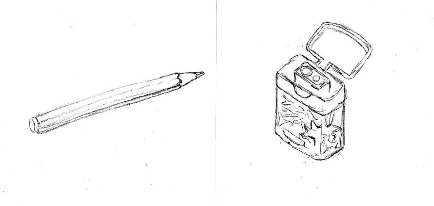
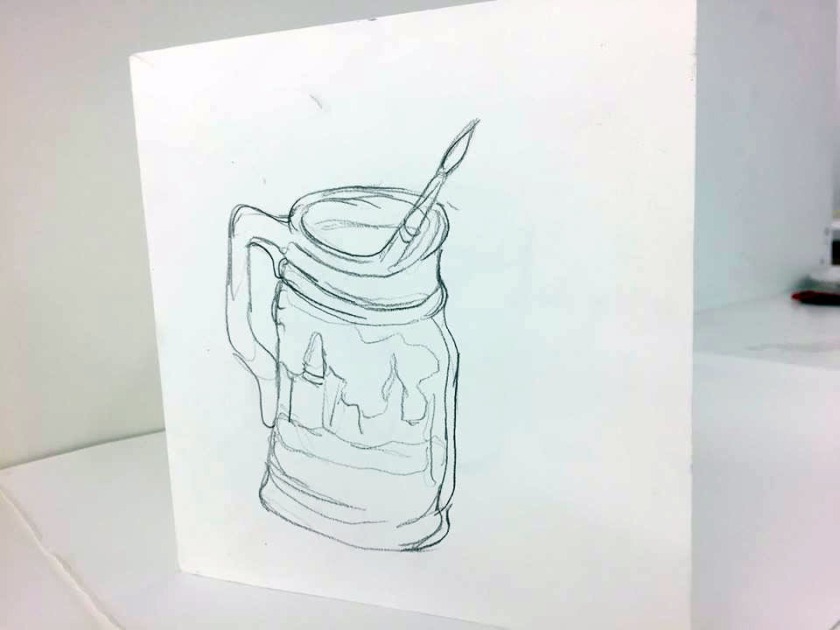
Whilst eating my lunch I tested my new pencil with a small observational drawing of my paint pot and brush. I enjoy and value observational practice and I also was really pleased with this swift and pleasing result. The context of the image of illustrating my art making utensils recalled my memory of the CV example presented in the useful Creative CV workshop that I had recently attended. One of the best CV’s included subtle images of the materials that the practitioner uses into the design of the CV which we as a group agreed that we liked and found useful about the CV. So… I have come to the idea as well as considering the possibilities of these zines extending into my word and image practice with using Photoshop/InDesign aswell as my engagement with aiding the funding for my year degree show. These Zines will exercise skills such as observational drawing, combining drawing and painting, word and image and compositional practice that will supply relevant aid to my professional book making project and supply transferable content for my website, cv or business card.
Working in 15.5 cm by 15.5cm square was inspired by a left over scrap piece of paper found in the pile of scrap paper from the guillotine work space. Square is the perfect window of space for my images and fulfilment of the few 5 pages that I have used. I am looking forward to adding words and colour. The words I plan to add later on appropriate softwares. InDesign will be the best one to use as it is the recommended choise for the contents of my Book project.
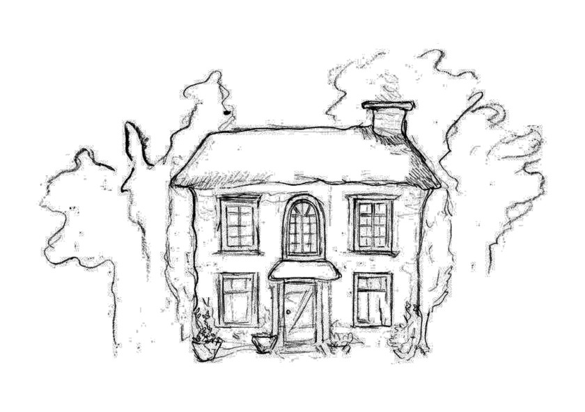
The below images show the production timeline of my visual image making of Grandma’s house for the development of my introduction of my Book 1 story. Starting with the first image I incorporated my inspiration and influence from my St Fagons visit using the images from my phone. I included from the resources and memory the windows, door and roofing that I recalled seeing. My first image was made with more time and critical thinking. I very much enjoyed the process of the abstract shapes of trees that I drew from memory to create the surrounding environment.
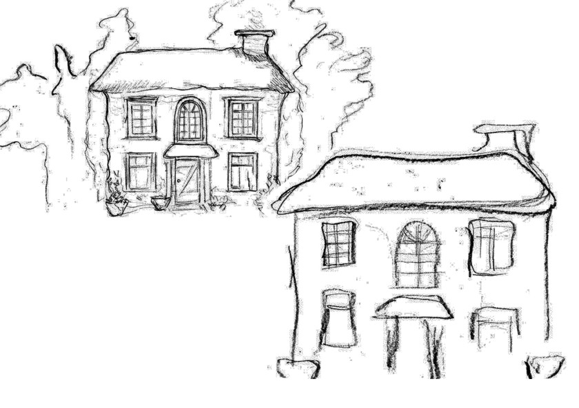
From my first carefully thought about image I wanted to redraw the basic shapes more loosely like I had established with the trees to allow for more of a fluid and imperfect image where a concern for symmetrical and straight lines are free of correctness. This was an idea to make the image more authentic, natural and entertaining rather than an exact copy of life I wanted it to be innovative and a statement for my ethos of just draw/paint.
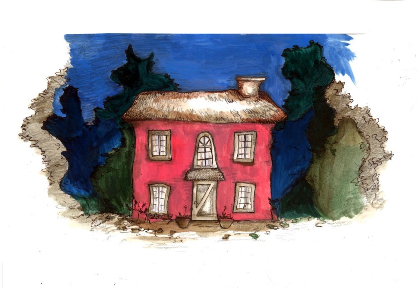
This image above shows my arrived conclusion of this project. When the spirit of the painting was lost the process of drawing with a change of tools would always bring it alive again. I am really happy with this result. The pencil was used for texture and the pen and ink was used for the feature of telling line. I am happy for my future projects to work in this way. The acrylic is used to give the strength of the colour that I am looking for. To improve this work the power of the utility of white space in my work is also something that I need to be wary of to invite for the space for breaks and thinking. The preservation of the background helped this image to create a balance of this inviting contemplative space and image.
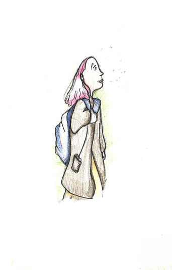
The picture to the left shares my university work space presenting the materials and resources that I am employing in my personalised environment to create my images.
The work that I previously generated always informs the next ones I plan to make so I have them on show in my space as I commence the development of my next images. I have selected to consistently work my narrative concept drawings and paintings in the space of A3 as my largest sizing of paper to work with as it is a dimension that I am most comfortable with. When I use anything larger the space is too demanding and the image size that I work with feels out-of-place and pressured in the large environment. There are also restrictions and an awkwardness of the physicality of manoeuvering my body to reach and meet the spaces of anything larger than A3. When I am using A3 I can manoeuver the page in my space and flexibly turn it to whatever angle I wish to efficiently assist my drawing ideas.
So far this week I have spent time into the production of my visual images for my working narrative intended for my Book Project 1. Find the story here. My excitement and motivation for the generation of visual images is really present and inspired from Chris Glynn’s demonstration in the latest tutorial that I had with him. After having spent a lot of the time over the term on the conceptualization of the context of my narrative. I realise the urge and importance of the image making. Up until this point my image making had felt only brief with time consumed in the theoretical, research and resource gathering practices that has filled me with fuel to start my relevant and informed image making journey.
Below is my character design work for my main character Mary. Mary in the intro of my story is really grumpy so I have explored annoyed and bothered expressions. I do wish to effectively communicate the moods of my characters in the work that I make.
Drawing and ink wash.
Chris’s advice had led me to a new and improved pencil-case of drawing utensils. The excitement has also come from the idea of using this professional gear which I desire to exploit and explore to their full potentials applying Amelia’s advice of drawing under and on top of painting. Drawing and ink washing used in this image above incorporated the environment setting of shadows, light and a texture. I love the process of drawing the most so it is important to me and for the result of better images that my line expression is incorporated into the finished artworks.
This term I have experienced the excitement, anxieties, high activities and responsibilities of Third Year. I feel I have learnt how to positively and productively use my working week as expected of me in my post-graduation career. I have practiced calming techniques and have employed positive perspective thinking to tackle stress/negativity to empower my self believe, gain wisdom and I aim for enjoyment in the work. This attitude has been a key and valued practice that I employed into my Manifesto that I use to remind myself of the simple acts that catalyse the happiness in my making.
I am proud of my achieved creation of a working narrative intended for my Book 1 and I am feeling eager to spend my time on the productivity of great visual images using the advice I have achieved from the valuable Feedback Tutorials and from those around me. I have enjoyed the process and understand the usefulness of the time spent on the purposeful collection of resources used for the inspiration and ideas of my project that engage me with the experience that excites my thinking. I can see how stimulating the senses can enrich the work I make and from my research can see how many illustration professionals encourage and use real experience to aid and sustain the generation of their work that interestingly connects and communicates with an integrity to life.
From my Dissertation running alongside this Book project I have seen how this interest into drawing and the unconscious has interwoven itself into the core of my beliefs and corresponds to the philosophies of my self-initiated narrative. I have enjoyed the exposure and engagement with the advice and wisdom from many creative people from the research required in all fields of my practice and particularly through the intensive reading required over the years of my Constellation module that explores the theoretical concepts of art practice. I have valued and participated in the various workshops that have improved my knowledge and skills with book making software such as InDesign with Georgina, Website making demonstration using WordPress with Matt, Professional practice thinking and research with guest Phil Wrigglesworth and Creative CV writing advice with careers advisor Es.
I have realised how working in the environment of University for my creative practice has engaged me with the practice of communication which I realise is fundamental to my mental health. I also realise when it is time to find a quiet space to work on my writing and theoretical practices and how a change of environment is really necessary to move the body and create in new spaces helps to motivate the work. The frequent touch with writing continues to drive my work forward and make my thinking and plans more clearer. My plan for next term would be to continue with the way I am working which is continuing to feed all areas of the module throughout my days/weeks practice. To improve my practice I feel I need to take more part in the Verticle Studio’s and attend more opportunities that arise to ensure that I don’t miss out on group activities and advice from practitioners outside of the university and in the working world of illustrating. I also wish to keep on top of organising my physical work as it helps to see the next step more clearly and helps with the communication of my ideas to others.
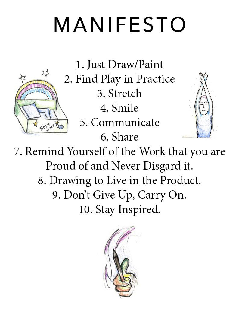
On the 30th of November 2017 I spent time to articulate and produce my own Manifesto representing my key beliefs and motifs of my practice. The task was to create a 10 point Manifesto using InDesign exploring a use of two different Fonts. The fonts that I used was Avenir (a sans-serif) for the Title and Minion Pro (serif) for the numbered points.
To prepare myself for this task I used the guidance from the Typeface and Indesign resources used in the workshop with Georgina. The information usefully recommended fonts to use and warned to avoid certain over decorative fonts. This task helped to familiarise myself with using the software of InDesign that is tied closely to my book making practice. I also really liked revising over the advice and learning the skill of selecting fonts and understanding the art of creating visual relationships in the space with words, images and colour. I wanted my Manifesto to be simple yet appealing and meaningful. Which I feel the title typeface works well to suggest the simple instruction and its importance. I also included my illustrations of these words to appear as subtle bringing the attention more so to the words which I feel has worked well with the strength of the black font.
Invent a treasure chest for my proudest creations.
Happiness in my journey.
Stretch it out.
I can see how this Manifesto is very versatile and can be used as an aid to summarise and remind myself of the goals of my practice.
My Manifesto 2017/18. My key beliefs I aim to work in my practice.
Chris Glynn’s illustration of making mini projects from my main project.
To avoid the missed opportunities of the production of future fundraising publications as I am working heavily on my book project. Having spoken to Chris Glynn my personal Tutor, we agreed that I could generate Zine’s from the development work of my Book project. Any little sparks of idea whilst I am making can be employed in these little versions of books to create fun zines and also related zines. Glynn suggested that I could do books on different types of Grandma housing designs, furniture etc. I am interested to see how this will progress in my developmental studies.
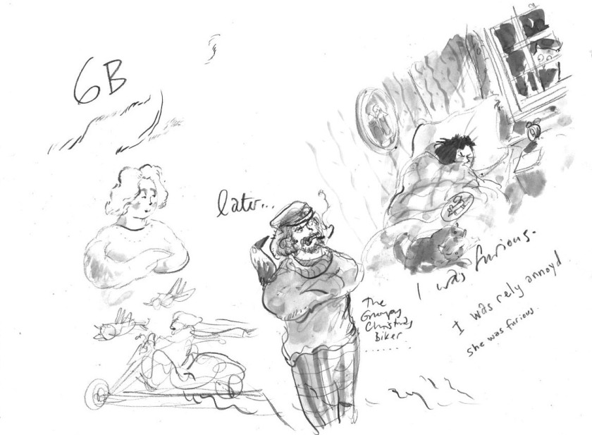
In my latest Tutorial with Chris Glynn, Chris demonstrated (see images below) the use of his favourite type of pencil known as the Faber Castell 9000 Jumbo 6B Sketching Pencil. This pencil worked similarly to my current woodless pencil that I believe is a 2B except I noticed how it didn’t smudge as much which would be really useful. I do also really like how my woodless pencil creates a gorgeous textured marking when angles in a certain positioning that Chris also really liked. I have already made plans to buy Chris’s recommended pencil from HobbyCraft at some point this week.
Practical demonstration – created by Chris Glynn
The above image at the top right hand corner show Glynn’s interpretation of one of my scenes from my story. Glynn invited objects from my photo’s of the places I had visited and introduced them into the image. I really like Glynn’s ability to evoke the emotions suggested by my words into the characters expression and it was incredibly insightful to see Glynn’s swift process approach that handles light and emotion so beautifully.
Glynn’s process used faded line then water down ink (medium brush size – also my favourite size of brush) as the painted element into this process then he later pronounced the image with deeper and darker line and darker ink to produce shadow and stronger contours of the features in the image.
On the 30th of November 2017 I made sure to have a Tutorial with my personal tutor Chris Gylnn. In this Tutorial I presented my more organised production of work for this Book project that I am currently developing. We talked about working textless moments of peace into the storytelling of my book. I really liked this idea of having moments of silence as my sketched images such as these ones shown below function effectively to tell what is happening on their own.
The speaking images:
Owl at window.
The owl looks intensily at the girls face.
Owl flies away. Girl spots some people dressed as owls running off with Grandma.
In the study of my written script Chris and I developed the idea of making the book a reflective narrative that tells the story of a strange memory that a grown up Mary (main character and child in my story) is recollecting/telling. I like this idea and it sets the story so that it is in the past tense so the text would be something like ‘I really didn’t like going to Grandma’s, the bed was uncomfy and everything was cold and old’.
These idea meant and Chris suggested the rework of my script.
The feedback I also received was that observational work is an excellent resource to encourage more lived and truthful experiences to produce stronger images that evoke more interest and integrity.
I have dived deeper into the research stemmed from another children’s book finding discovered at Jacob’s Antiques Centre in Cardiff. Using the internet I was able to investigate the many more illustrations produced by Nick Butterworth. From this discovery I realised that I don’t much like the dull colours and approach of the contents of much of the images that Butterworth creates. However I do see how Butterworth’s images show a resemblance to the story of my work and I can see how this research is useful to point out how I don’t want to go about my images. The worst detail about Butterworth’s images are that they are not playful enough with the perspective as these images below show how the main feature of image is consistently served straight in front of the viewer. I however would like to see more depth of the environment of the room and scenery and invite the characters in less central positioning of the page as I find it rather irritating that it’s so easy that it makes the sight of everything around this focus rather lazy. I would like to invite my images with appreciation for all of its working content that has more role of collaboration and functioning in the scenes. These close-ups off less room for the imagination and the curiosity of things.
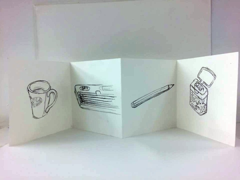
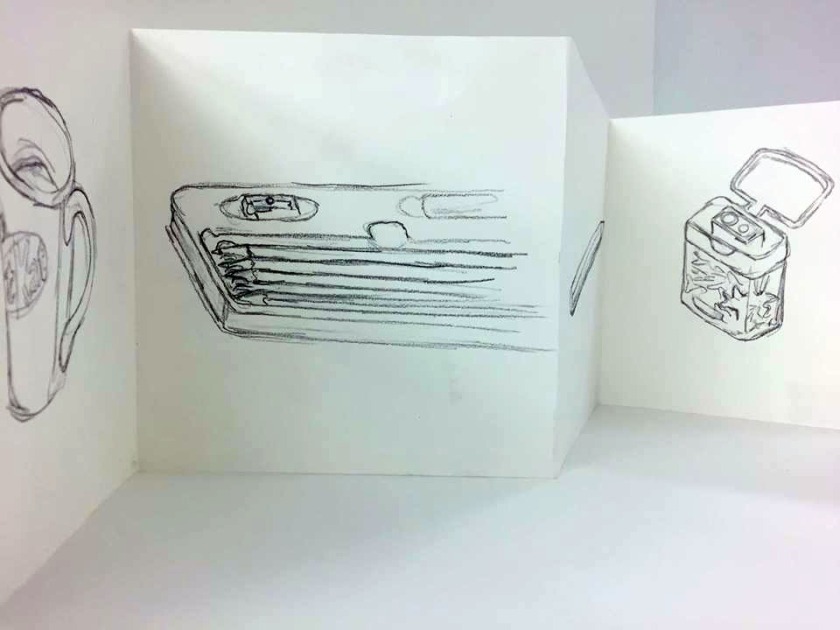
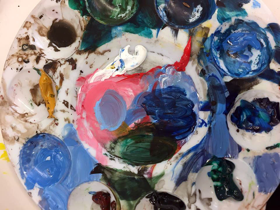
 The picture to the left shares my university work space presenting the materials and resources that I am employing in my personalised environment to create my images.
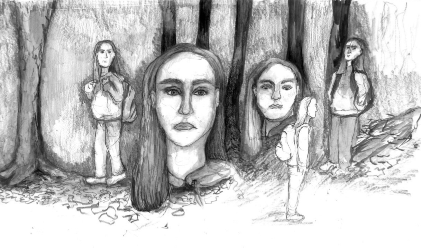


 I have dived deeper into the research stemmed from another children’s book finding discovered at


